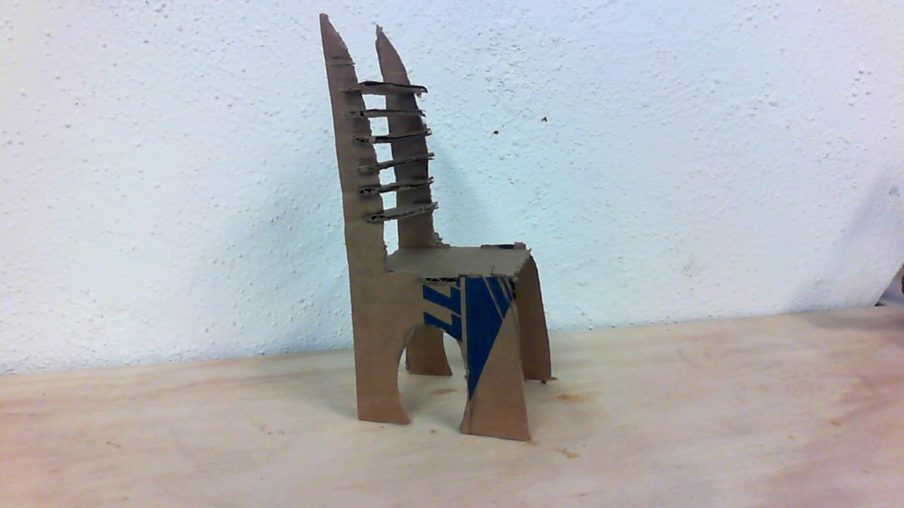
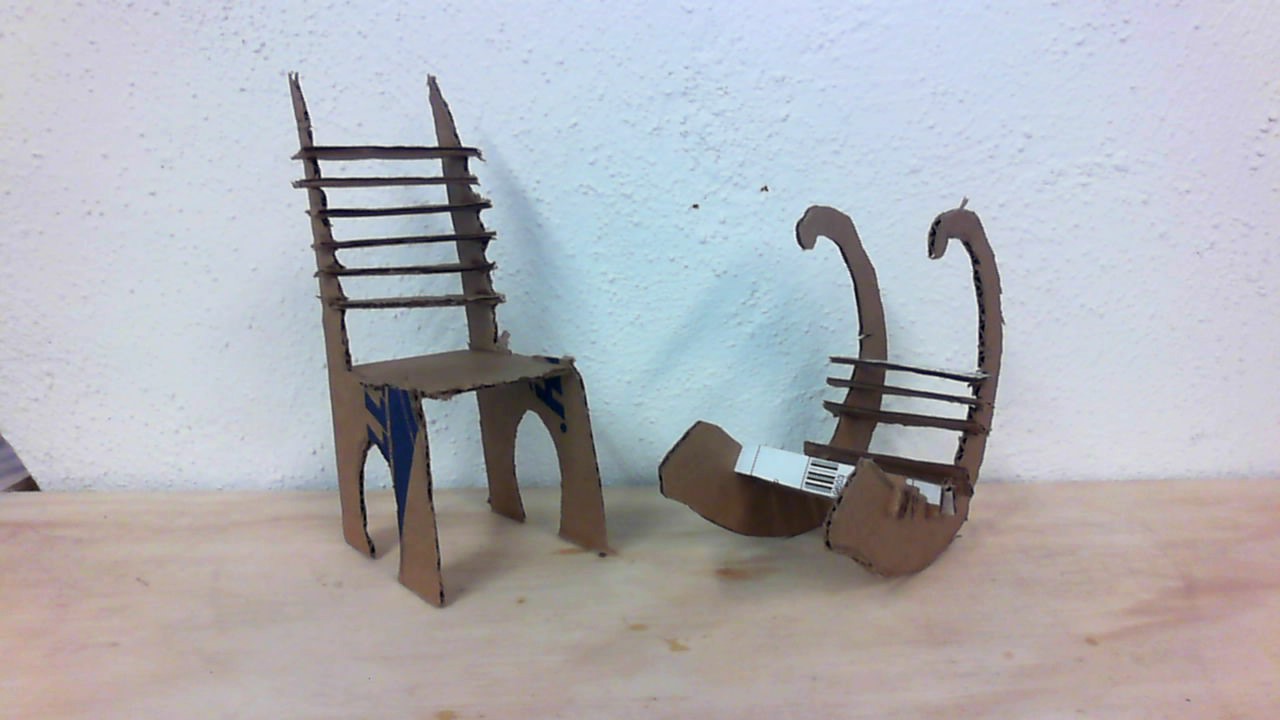
 This first prototype of my chair has assured me that the design is both functional and of reasonable size.
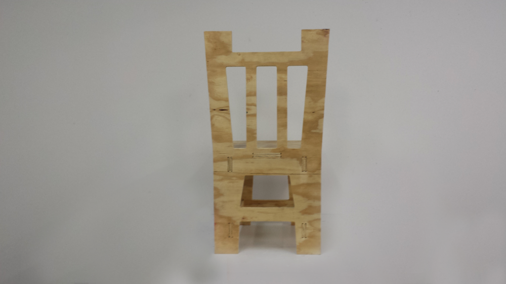 The main structural integrity of the chair is fine, however the backing of the chair requires some reinforcement.
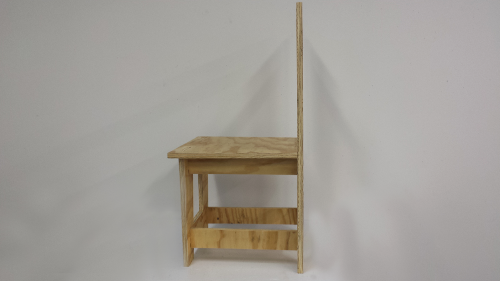 I will probably need to place a piece of wood perpendicular to the backing of the chair on either side running down to the floor.
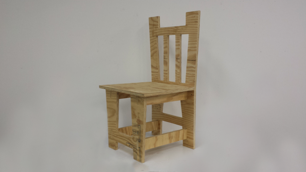 The main aesthetic design is a bit different than what I had first envisioned however I really enjoy it and would like to continue to use this style.
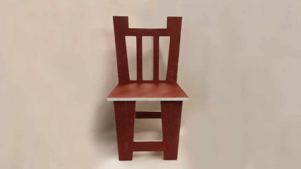 For my next iteration of the chair I would like to keep the form of the chair almost the same but create complex etchings and designs to the chair in order to make it seem more ornate.
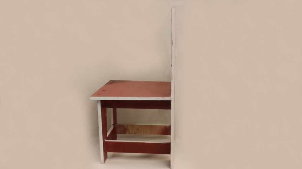 The painted prototype has also helped me envision what I would like my color scheme to be. The color also shows very nicely on camera which should make photographing the piece much easier.
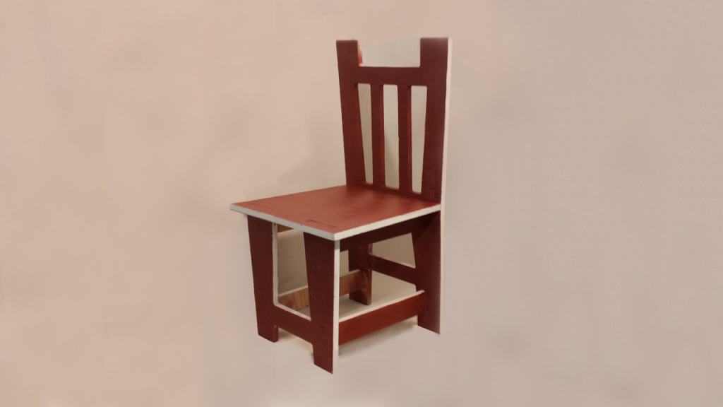 The Burnt Sienna with white accents seems to allow the chair to be a part of two different realms; a classic, adult style and a child’s room style. This can work very effectively with my upcoming altered concept.

The proportions are not as I would like them, so I must rescale the pieces to where an adult human would be able to sit in it.
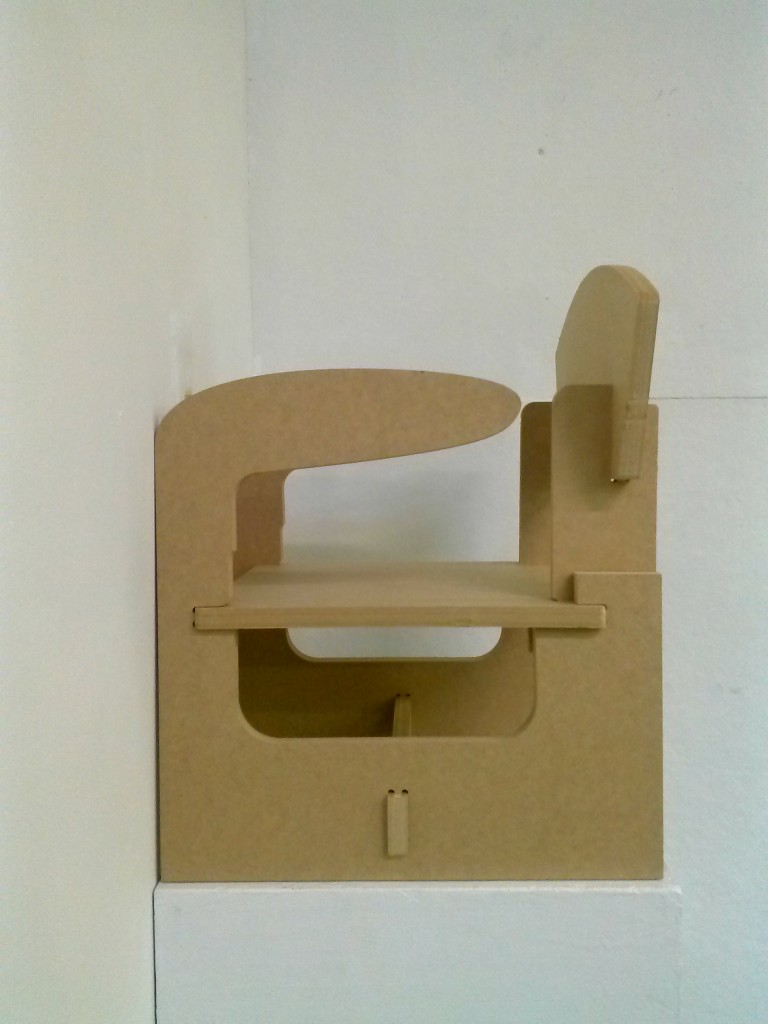
I also need to add lips to the bottom support beam. I plan to redesign the bottom “feet”, to where there is less surface area of the chair that is touching the floor.
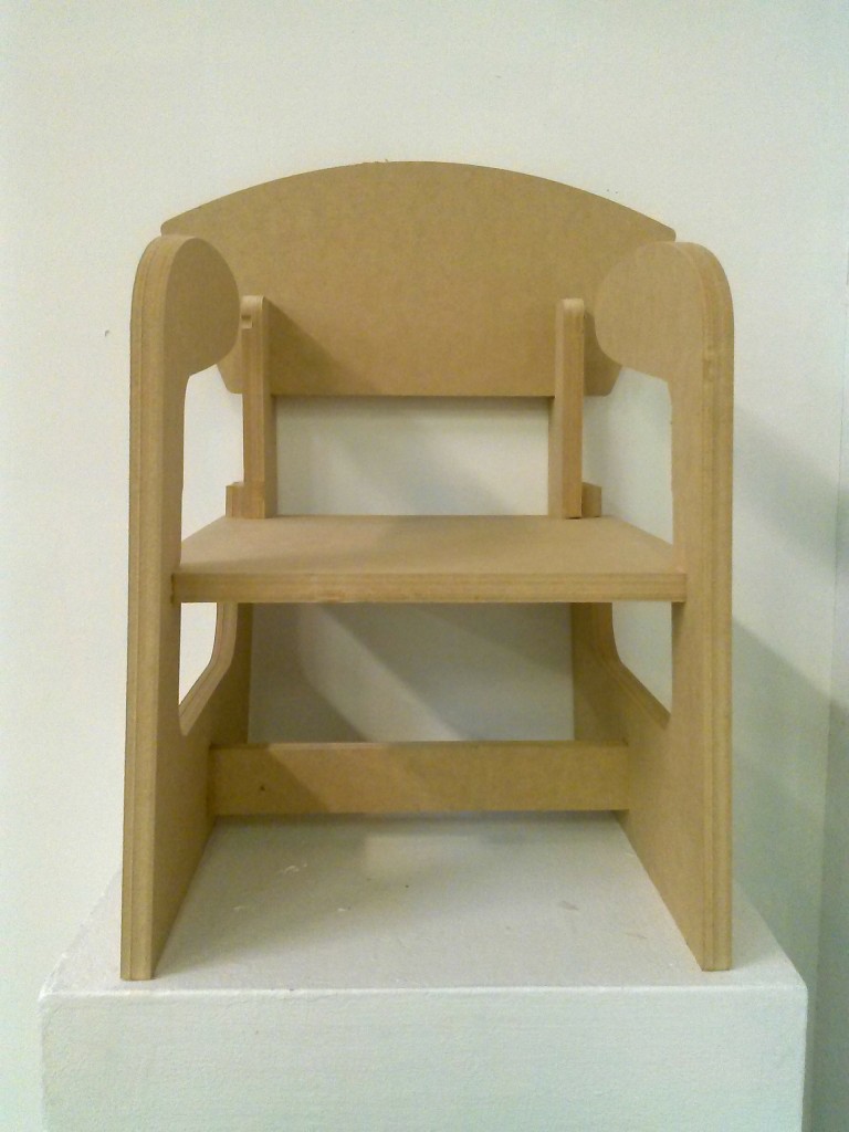
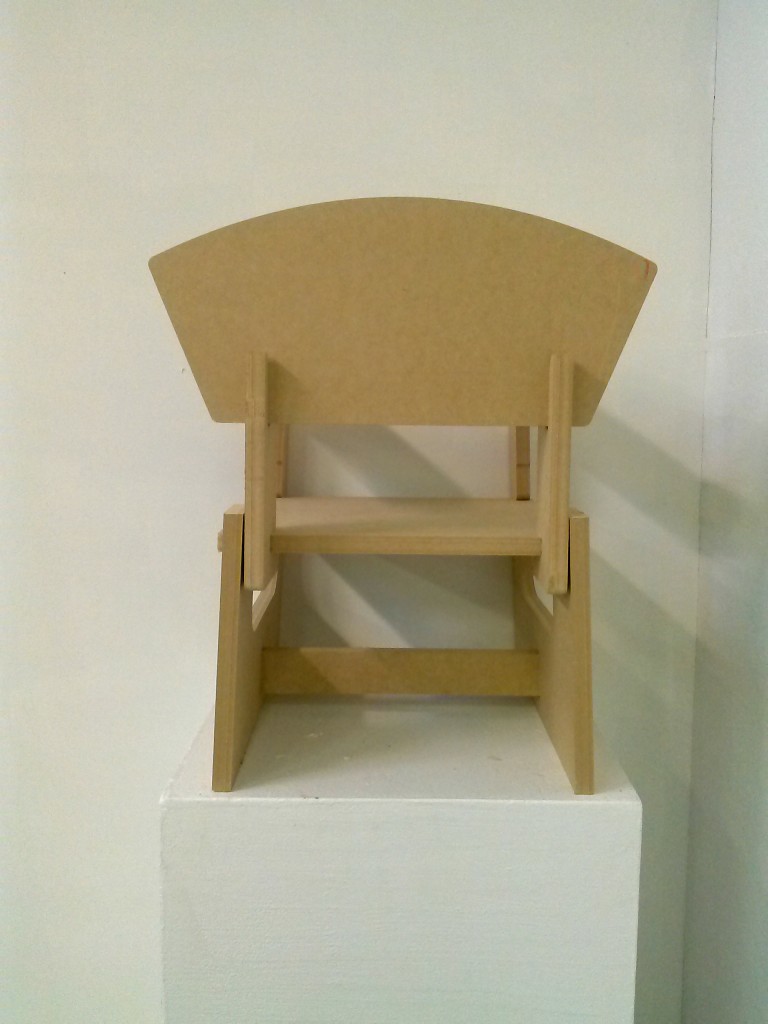
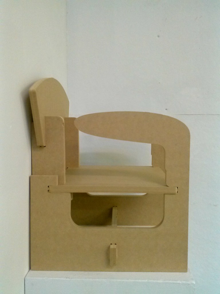
Upon rescaling, the armrest might become less stable, so a redesign of that would fix the issue.
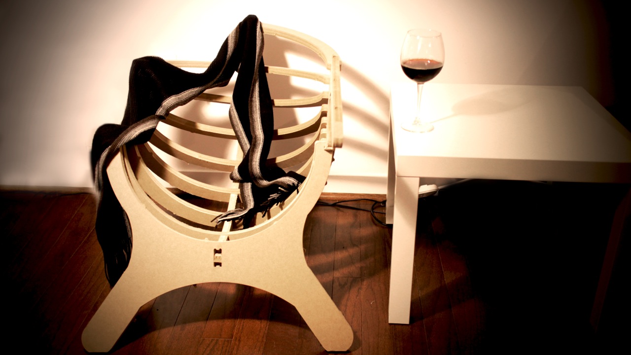
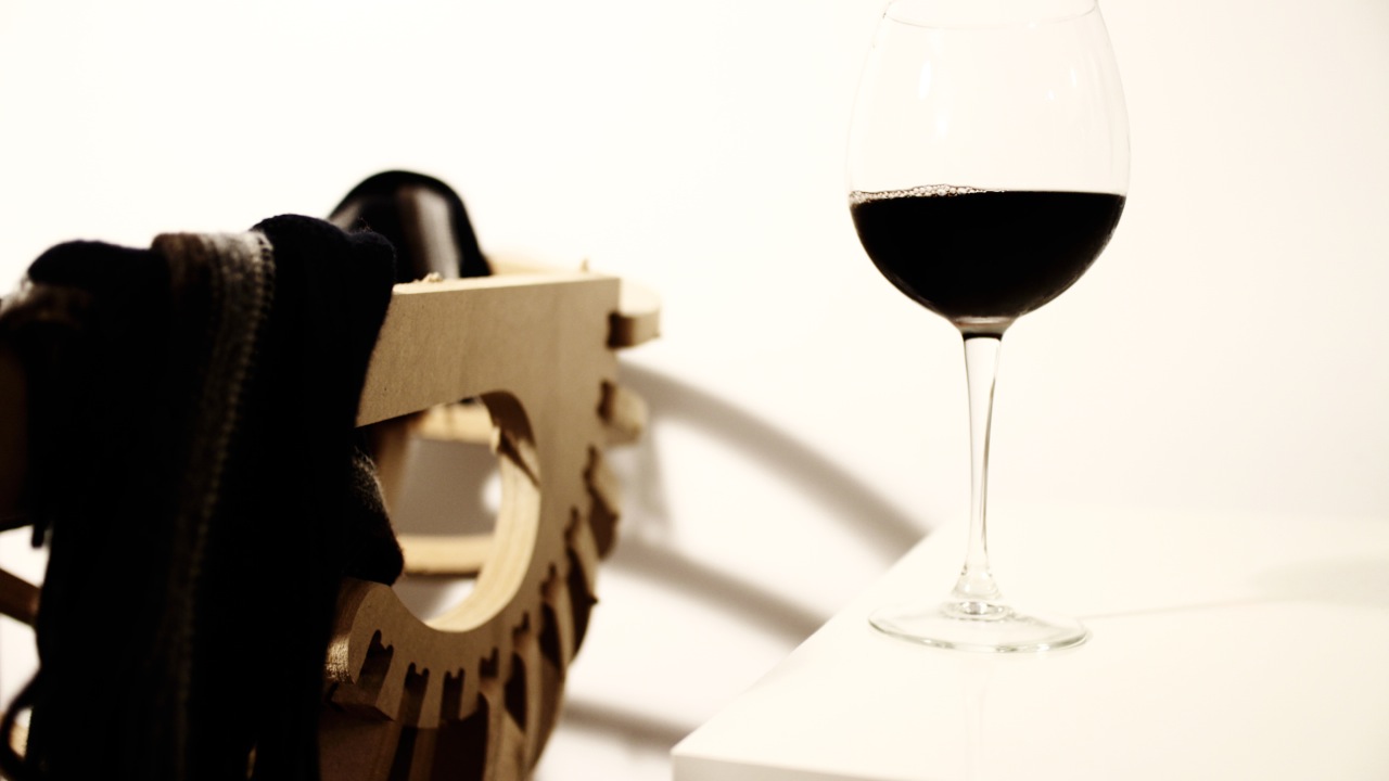
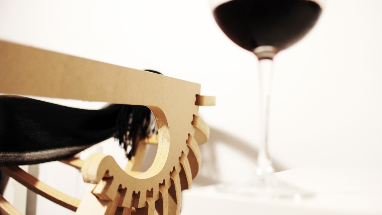

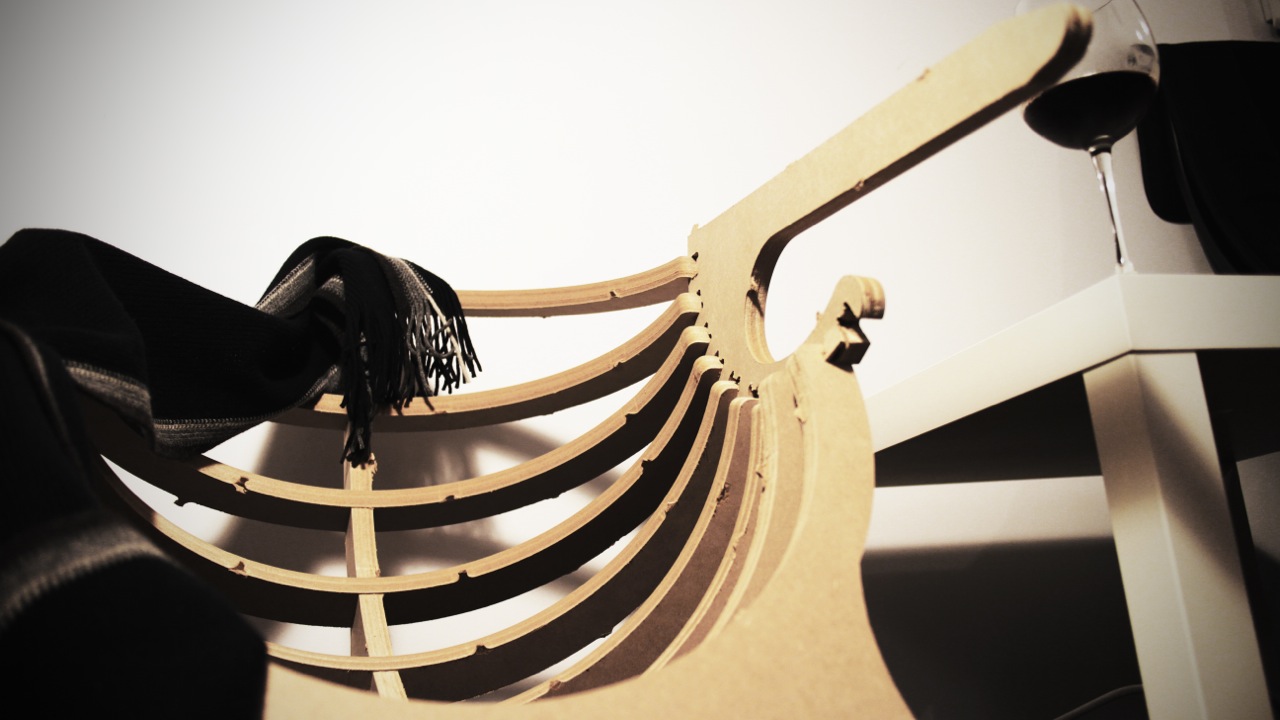
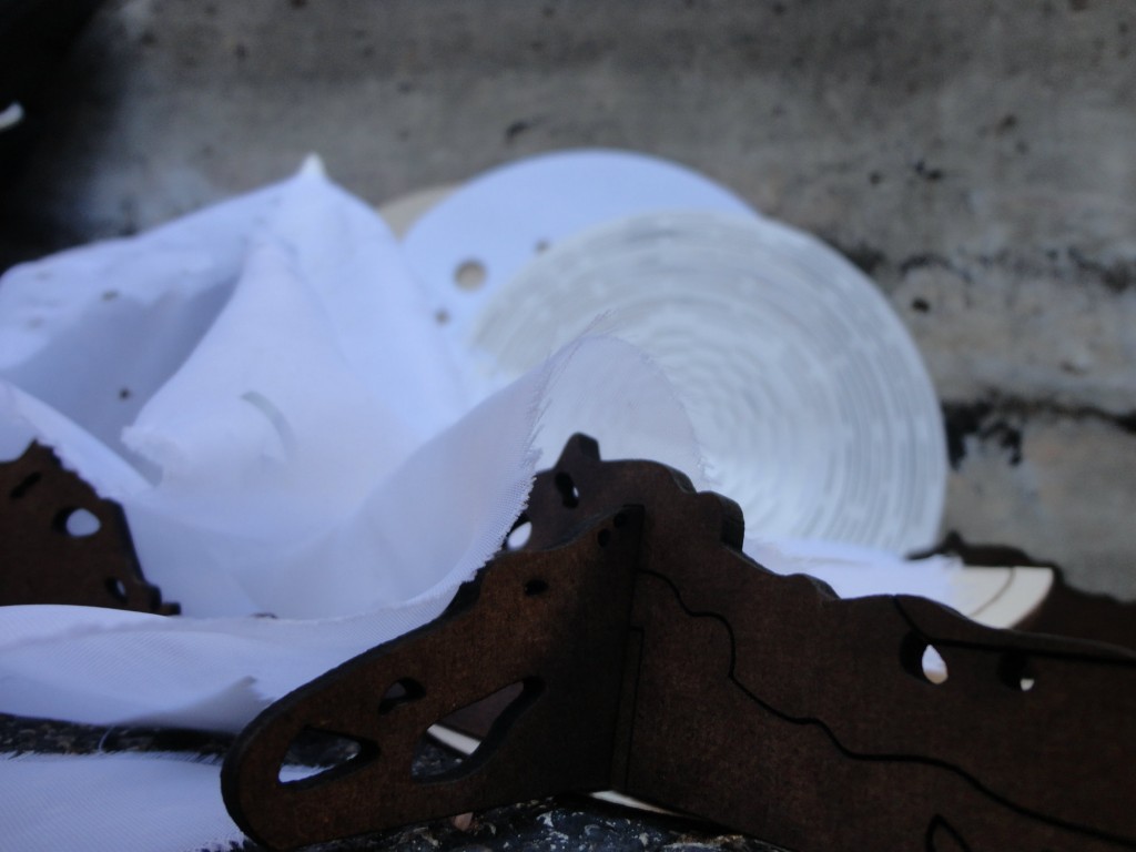
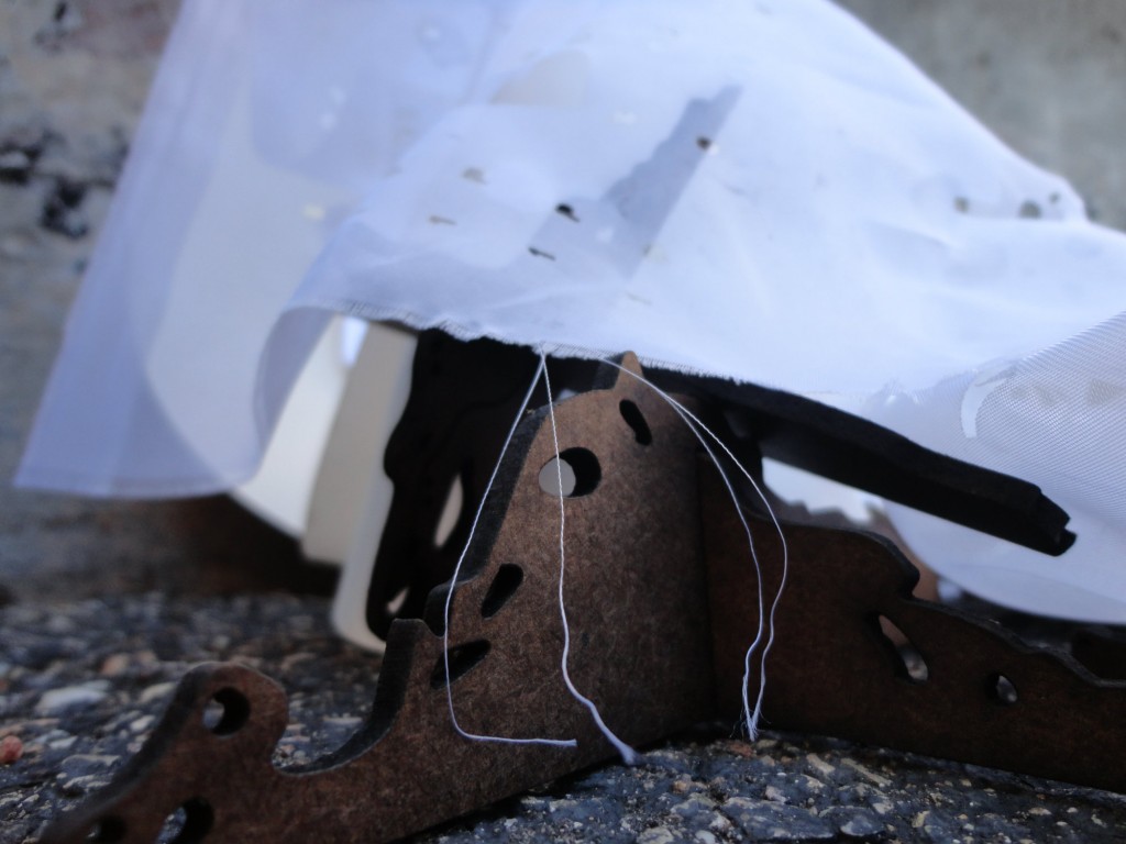
The MDF was a bit too thick (.75in.) for my chair design (.73in) the fits were snug, and that part was okay. What wasn’t so good is that when the pieces were bring jammed together one broke on top and in the front, right where the scarf conveniently fell. I will use thinner plywood instead of MDF to fix this problem. The front hole needs to be placed up on the z plane, so the weight of the spine doesn’t fall relying only on the sides and instead the bottom for support.
My chair is also missing an arm, this is because in RhinoCam I accidentally made one of the arms an inside cut instead of an outside cut. The final shell chair will also be sanded down.
This is only one of my two chair designs. My other chair’s main component is still being tested out. I’m finding a way to bend the MDF or plywood using kerfing. So far it has been unsuccessful, but I hope to succeed in time for the final date.
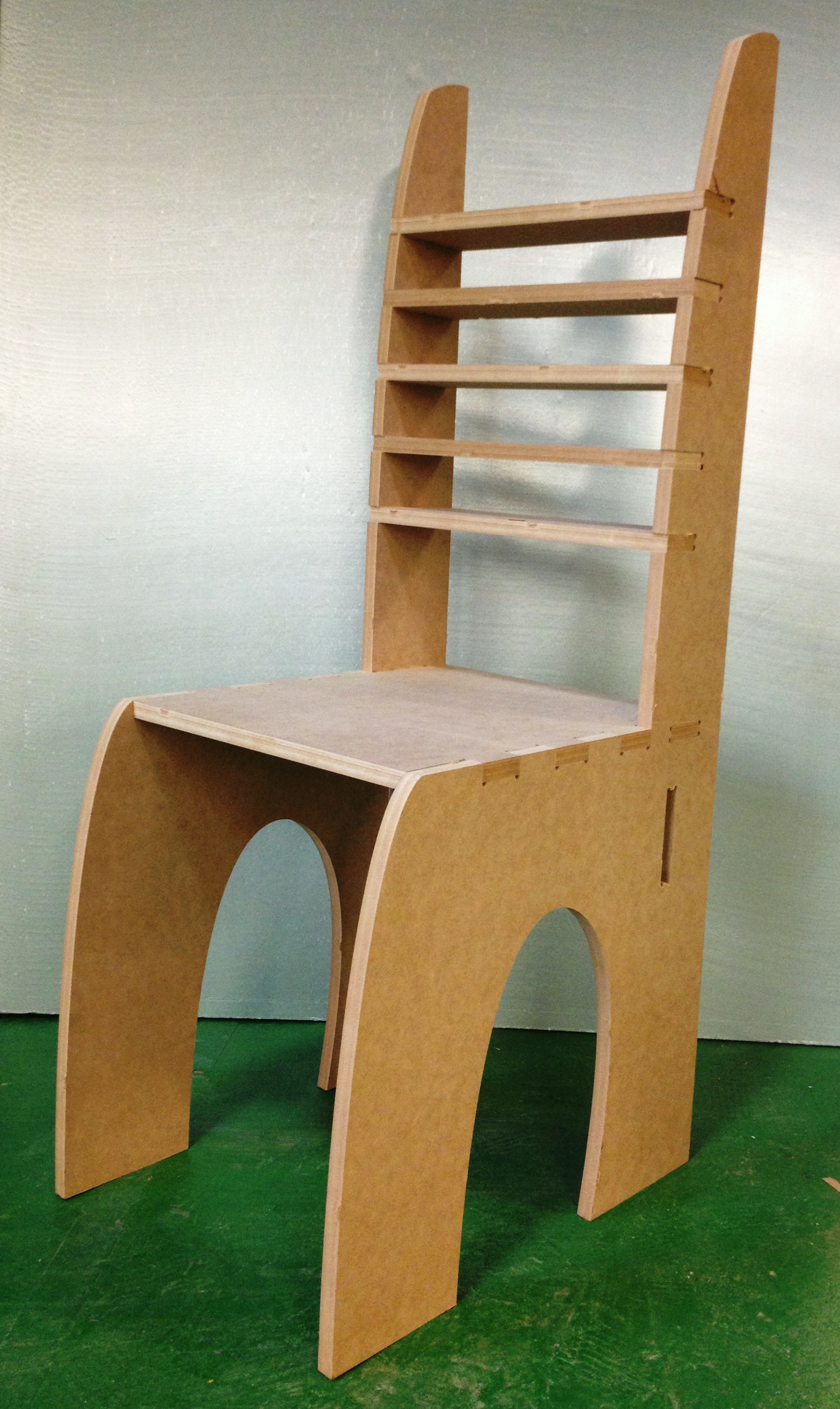
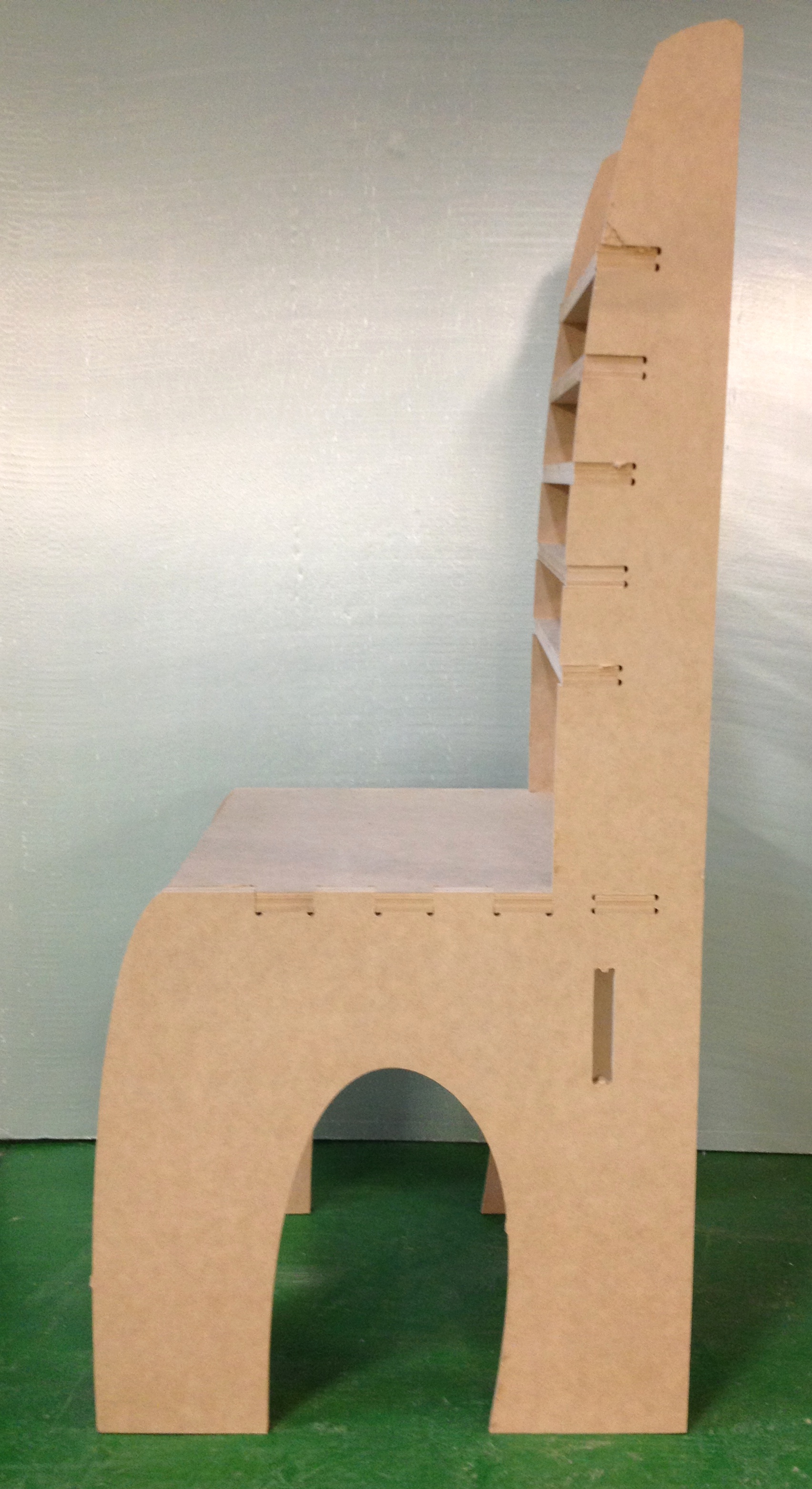
This prototype represents one of my designs. Although it went fairly well, I found quite a few things to improve my design by creating this prototype.

I discovered I need to resize the support piece and the slot for it on the back legs . I’m also considering putting the support on the front legs after sitting in the chair myself. I also plan to make the cut out between the two legs more ornate on the final chair.

I also need to realign and measure my finger joints that attach the seat to the legs. They did eventually fit together but it was a bit too tight.
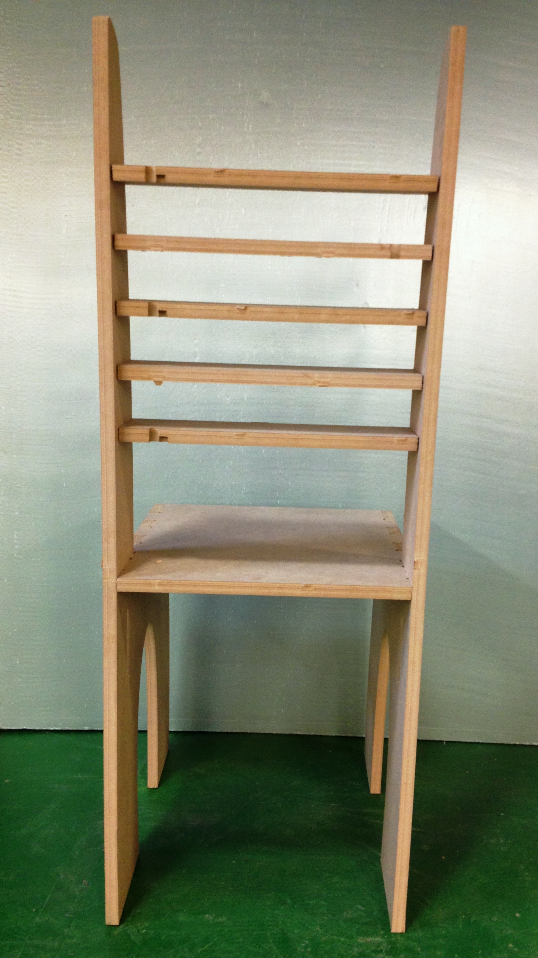
I also need to remember to change my approach in rhinoCAM as you can see where the approach cut into the back of the chair pieces
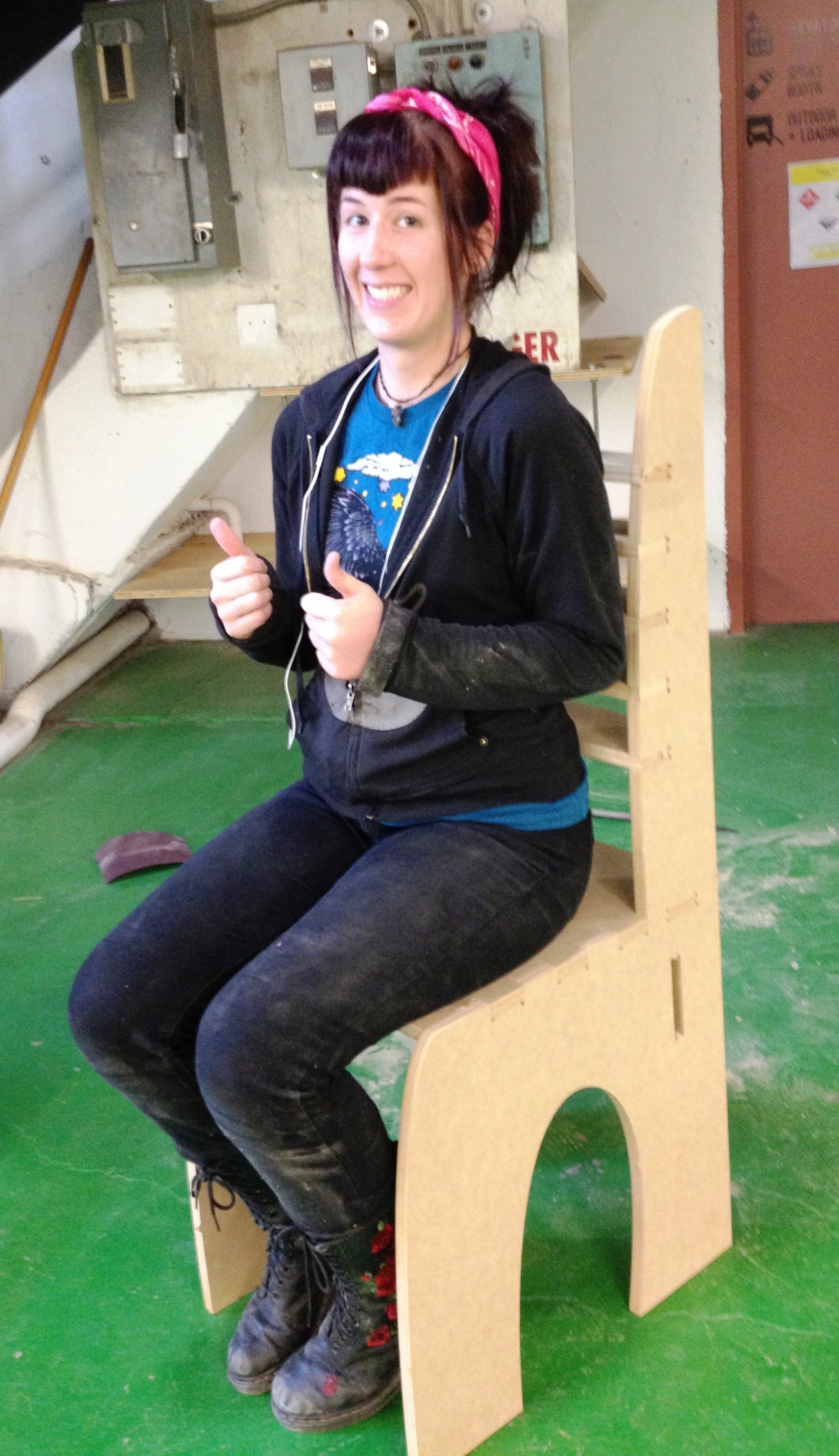
And as for proportions…

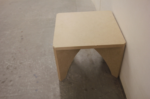
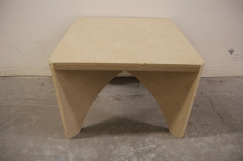
The legs and the seat could fit better with the seat’s joint space widened a bit (approximately by 0.125″?).
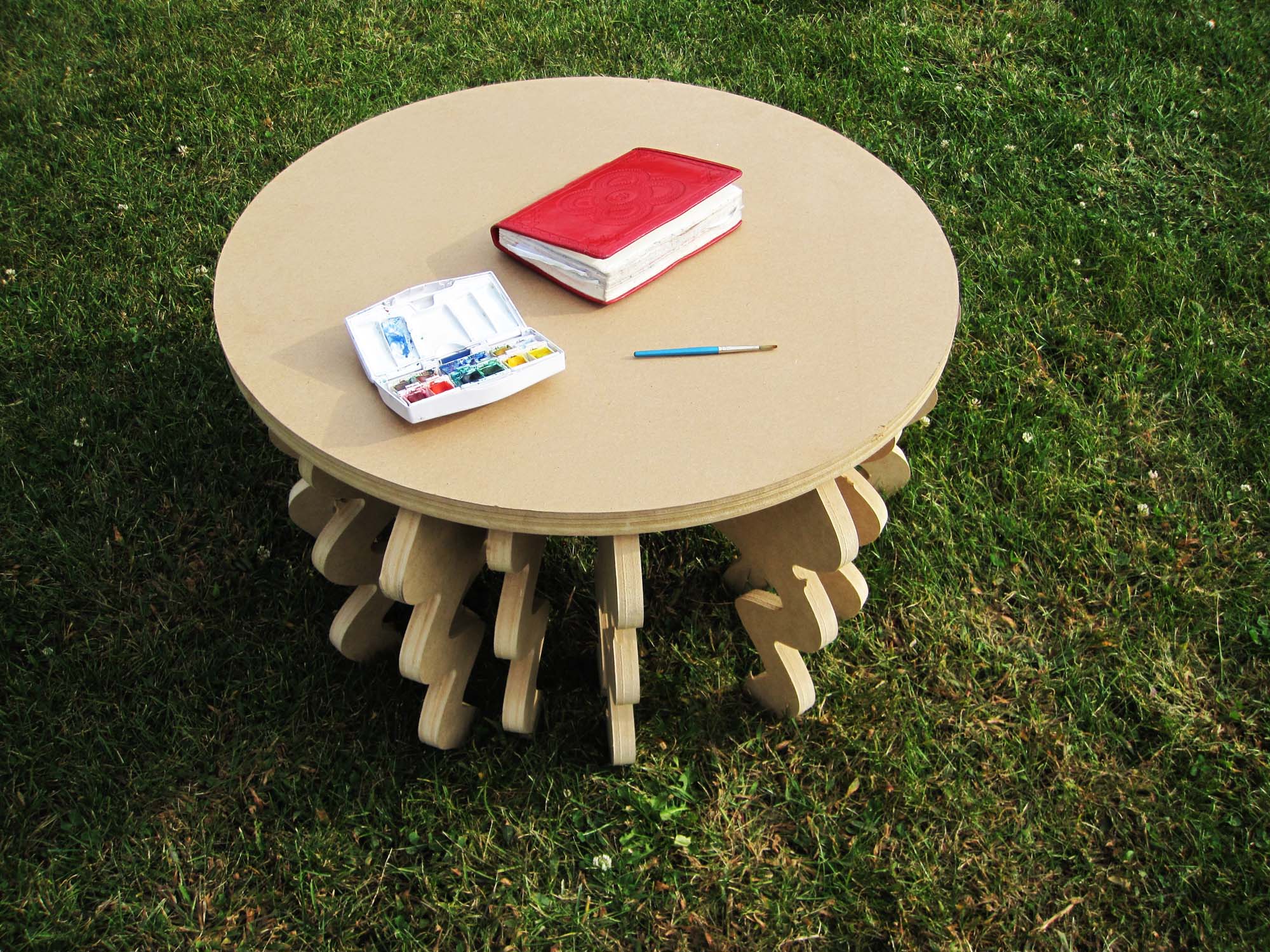
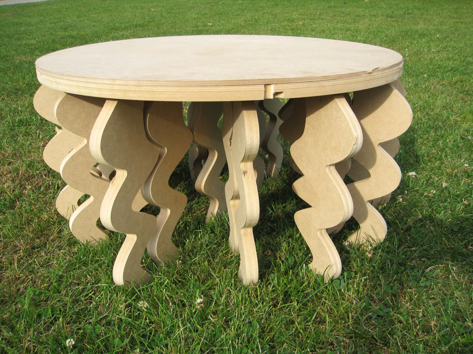
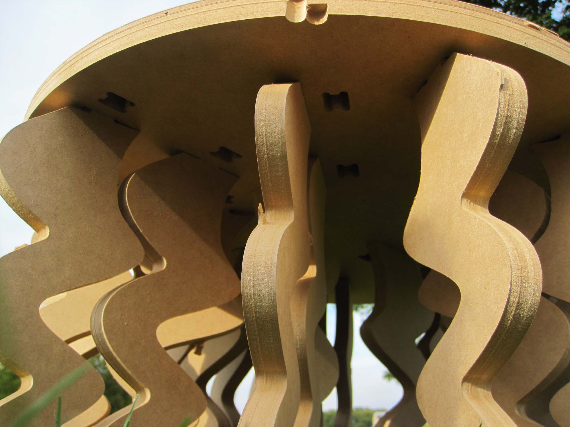
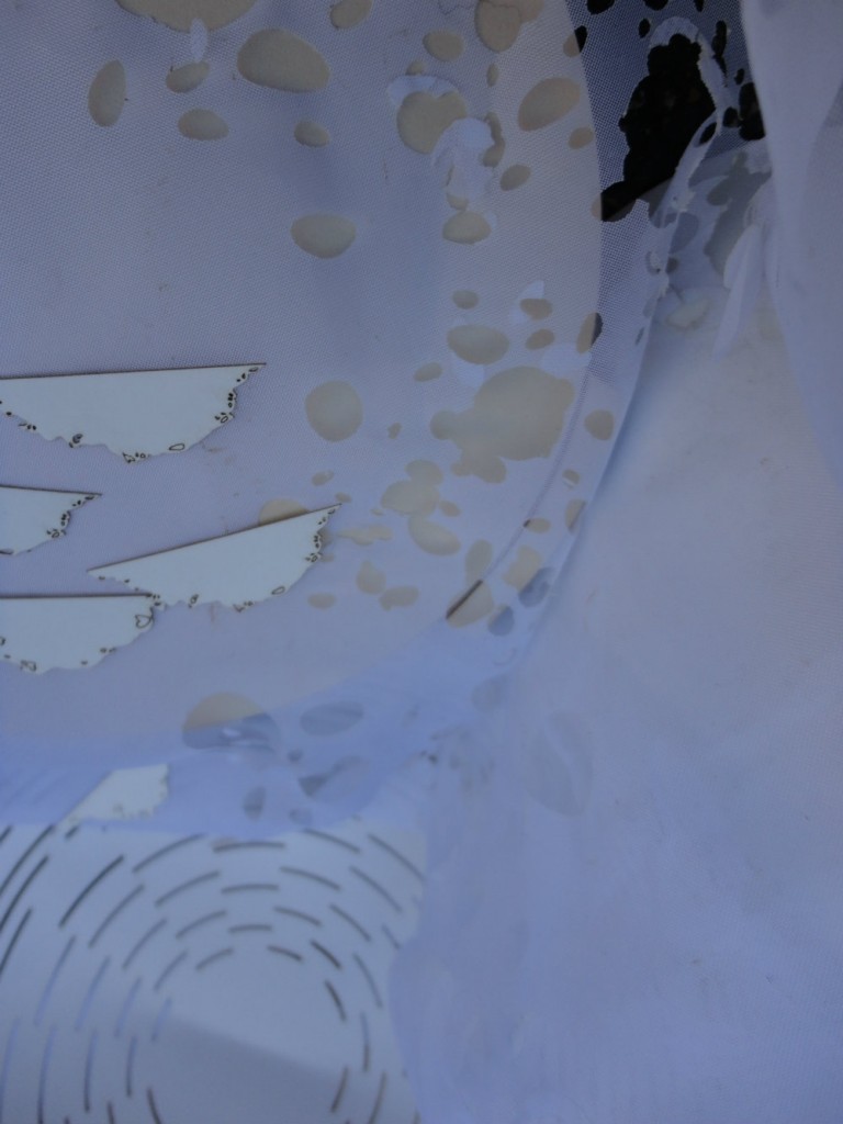
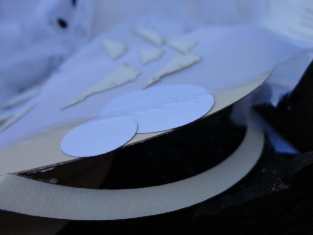
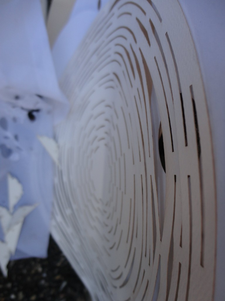
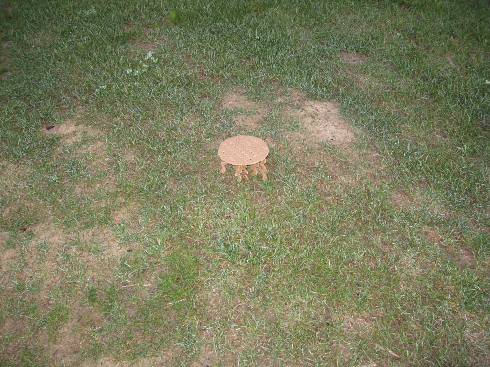
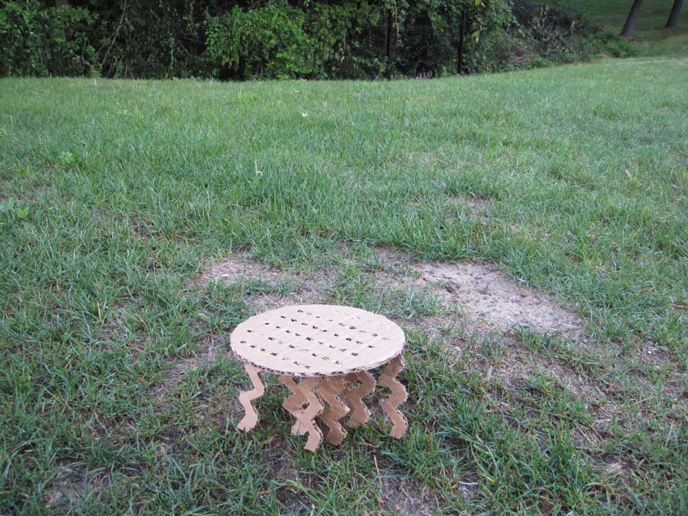
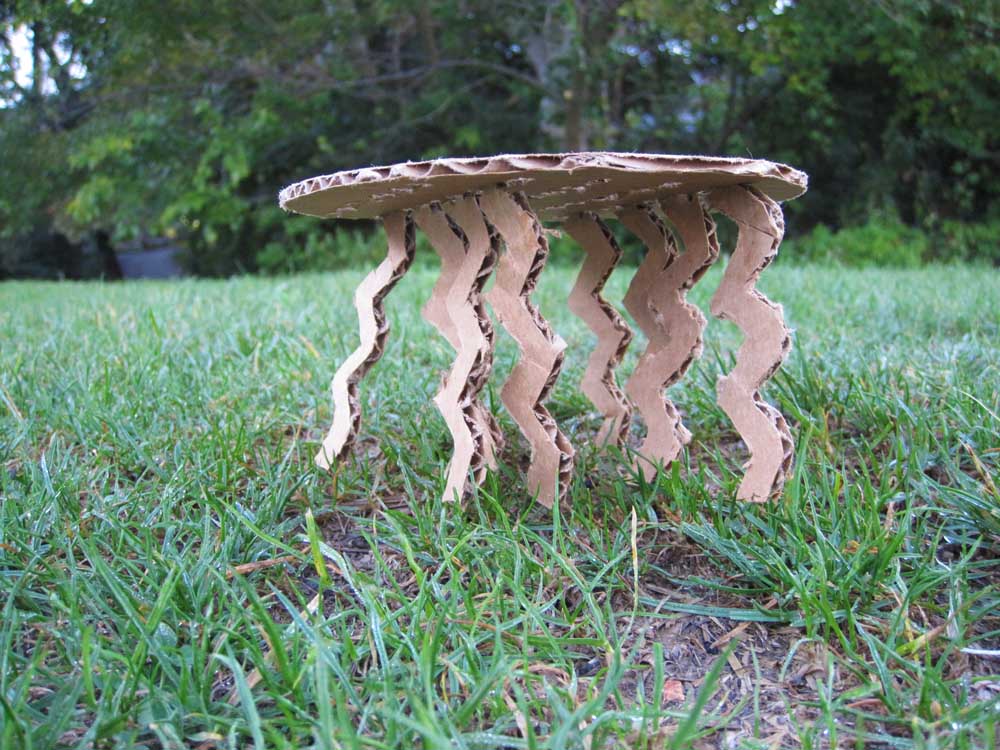
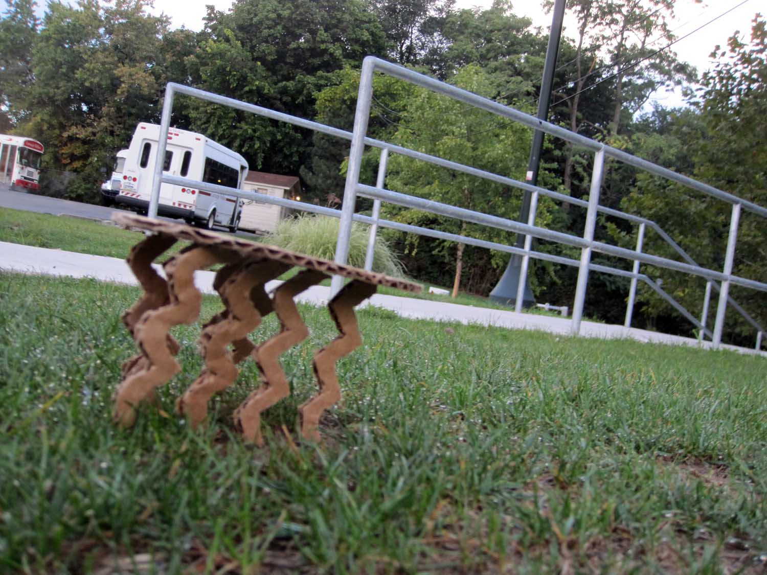
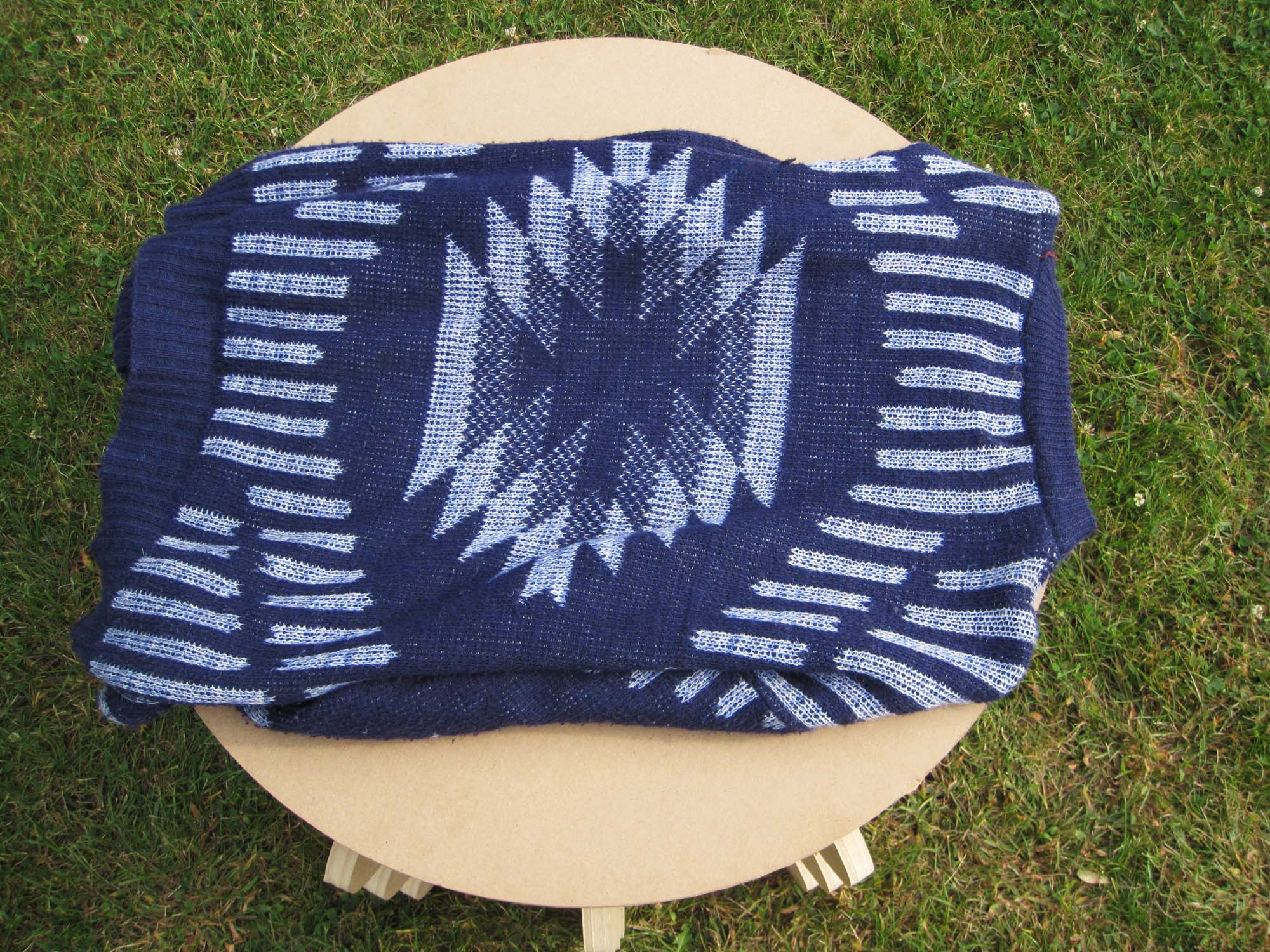 Visually, this chair came out the way I envisioned it, but it was not physically secure. The triangular support pieces I made did not fit correctly and I had to leave them out. I plan on making pieces to secure the legs against the table top on both sides in the next version. I will also make it so the legs do not connect all the way to the surface. This time to hide the ugly bruises of the legs sticking up, I cut another circle to place on top. I found the size of the seat and the height of the chair to work for the idea I was trying to capture. On the next version, I want to make the placement of the legs look more purposeful. I did very carefully choose where to put the legs, but it seems from the sideways view, very random. Another addition I would make is a cushion. A flat surface as a chair is not meant to be something to lounge on, but at the moment, it would be difficult to even relax with how hard the chair is.


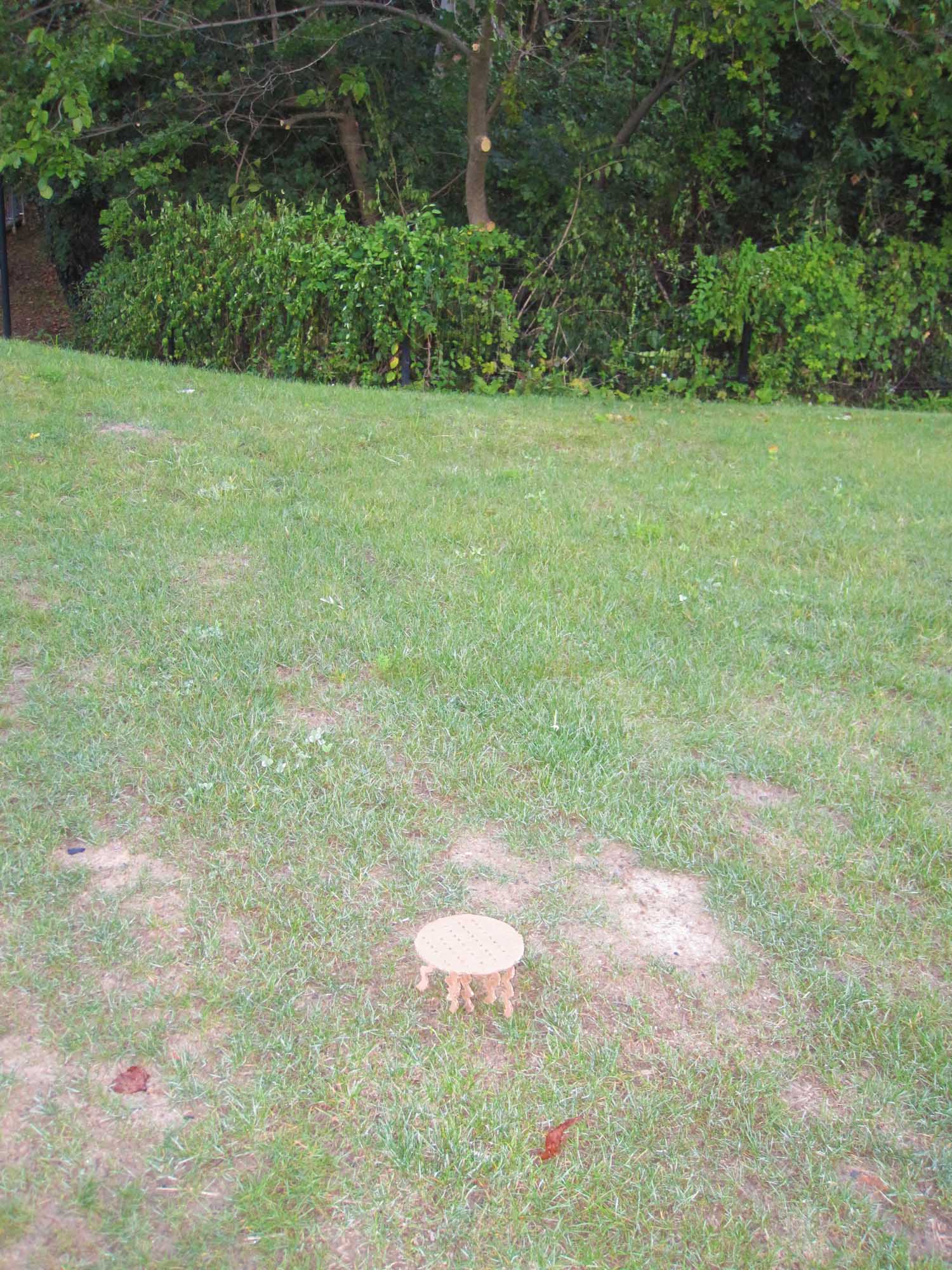
I went to a Quaker High School for three years, but it wasn’t about religion or god. It was about inner peace and meditation. I imagine this chair being used in that mindset for an intimate conversation or a group reflection similar to a Quaker meeting. Quakers sit quietly until they feel the need to speak. This is the environment I want to create. I want the sitters to be surround and close to nature which is the reason for the low seat. I want to sitters to find inner peace and connect to the people around them. This chair can be anywhere where you can reach your hand down and stroke a blade of grass or a leaf. I chose to place the chair on a little clear grass next to the Morewood parking lot on the way to my dorm. People can stop, think, and converse here. College students and the community can find a moment of peace in the middle of their hectic lives.


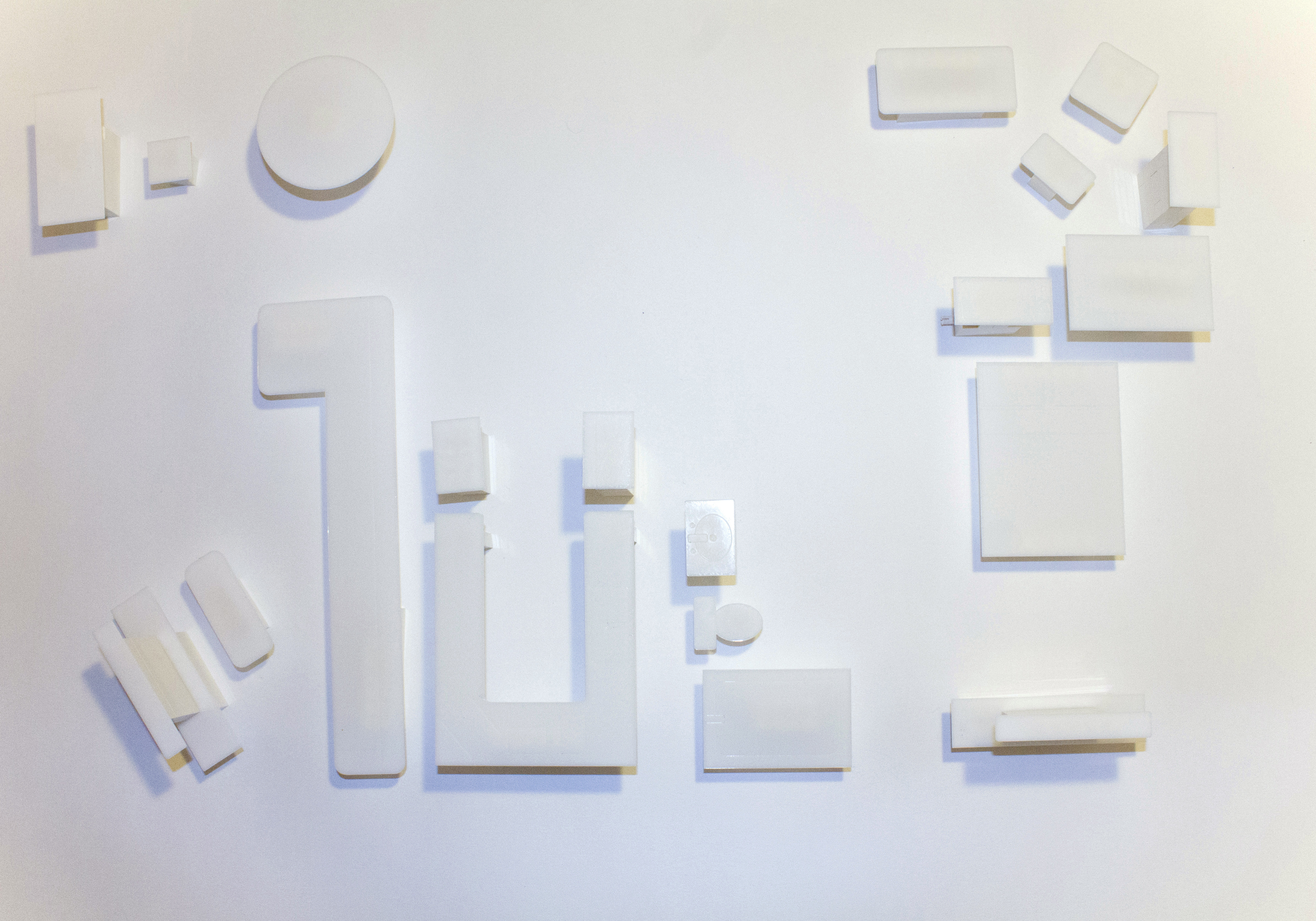
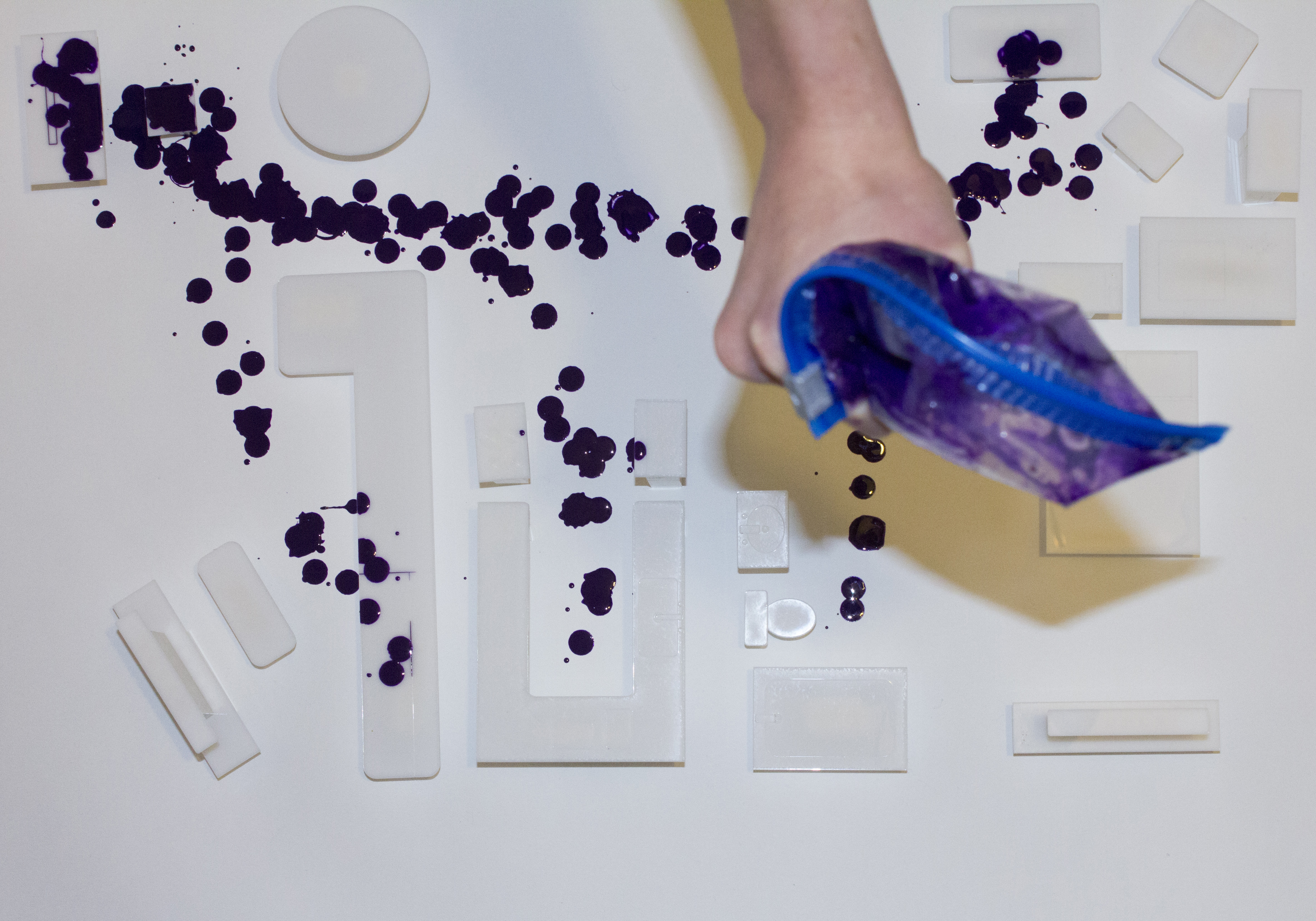
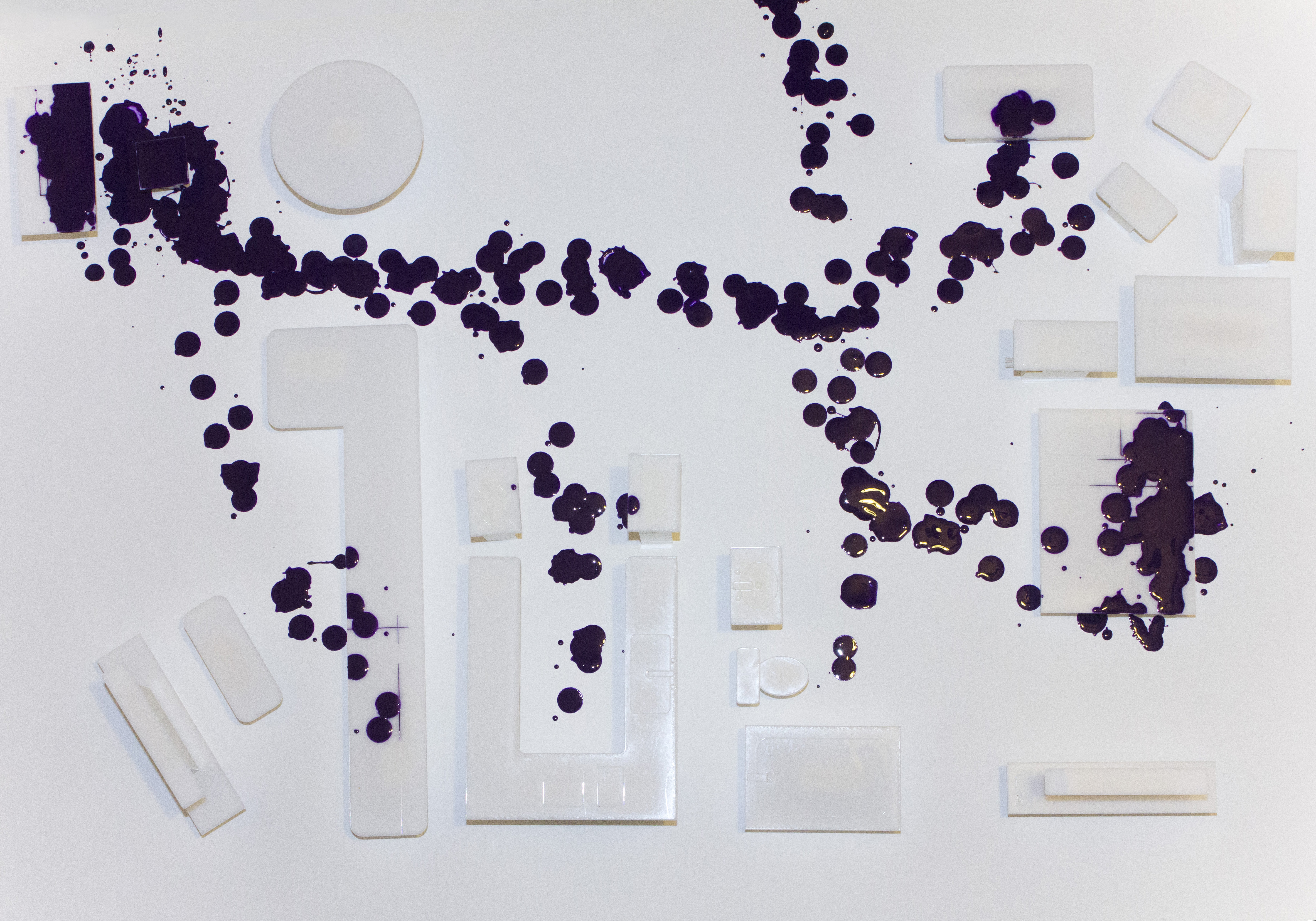
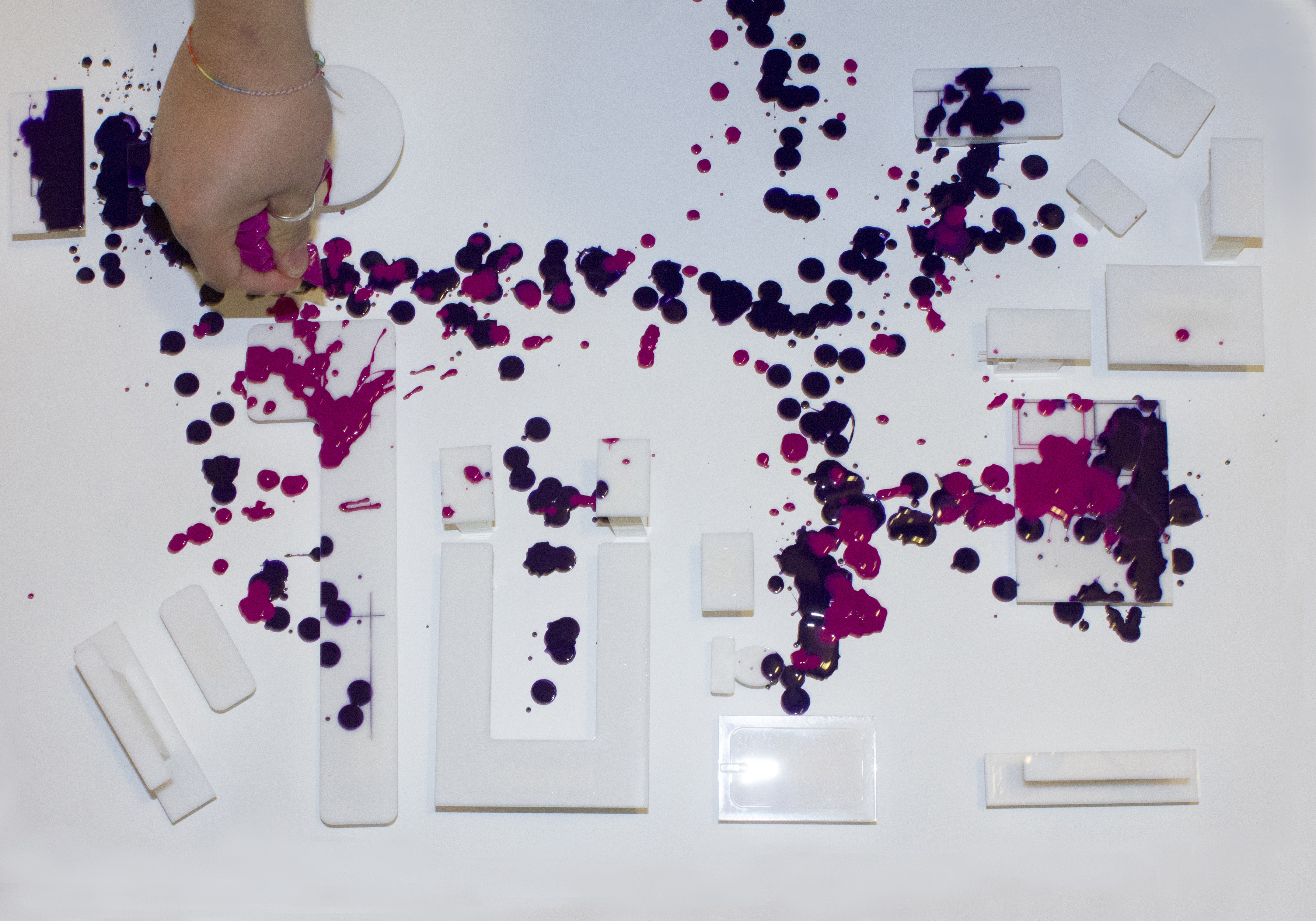
As I set out to create a story about an imaginary habitat, I wanted to focus on the idea that inhabitants are what make a habitat more than just a place. I relied on my own home environment to draw inspiration for representations of habitats and inhabitants. I focused on how people can occupy the same space in such different contexts. How do people choose to interact with a place? At the same time? At different times? While co-inhabiting, what are there relations with that space and with each other? How do they feel about a space and the objects in that space? What do they associate with those things? How do the meanings of those spaces and objects differ between people?
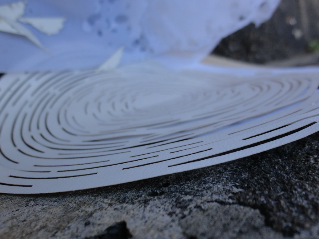
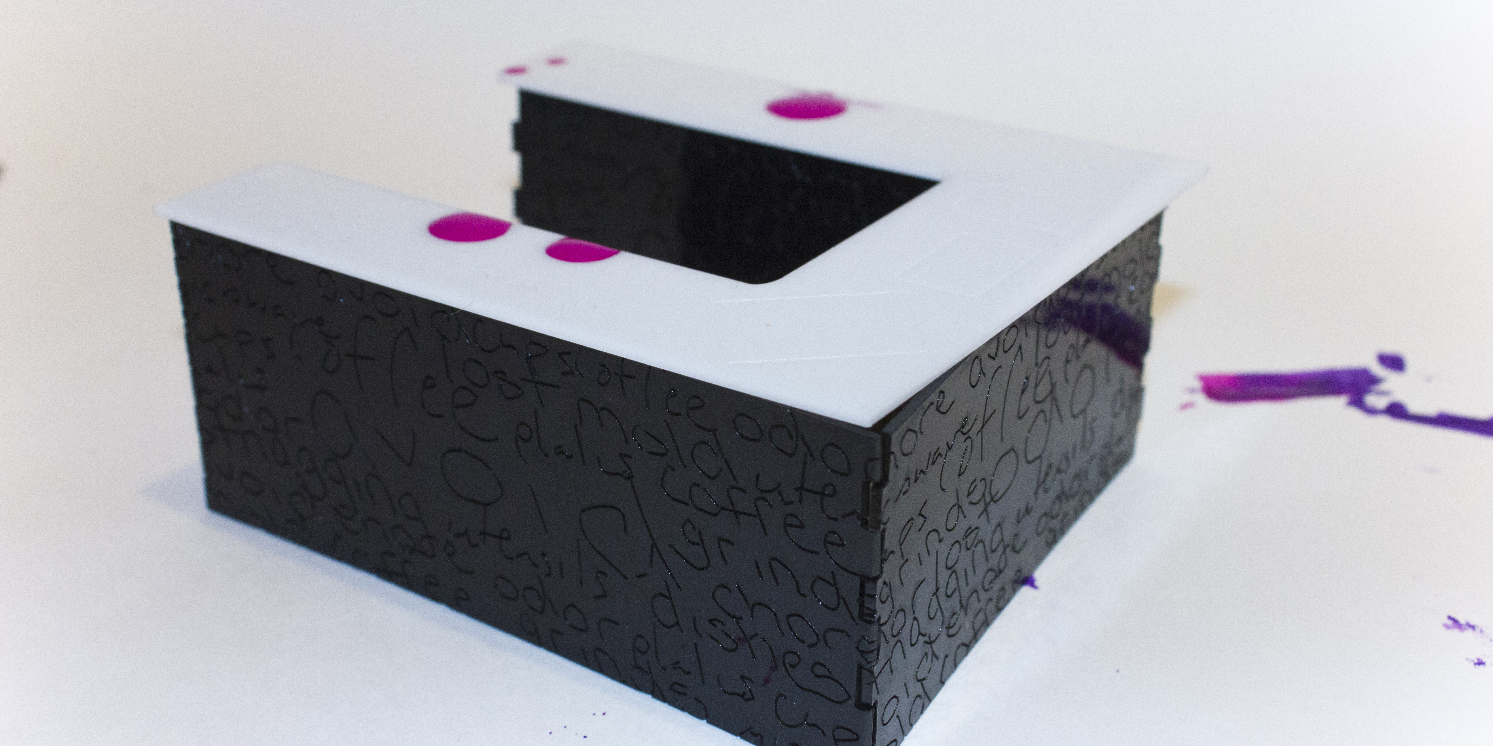
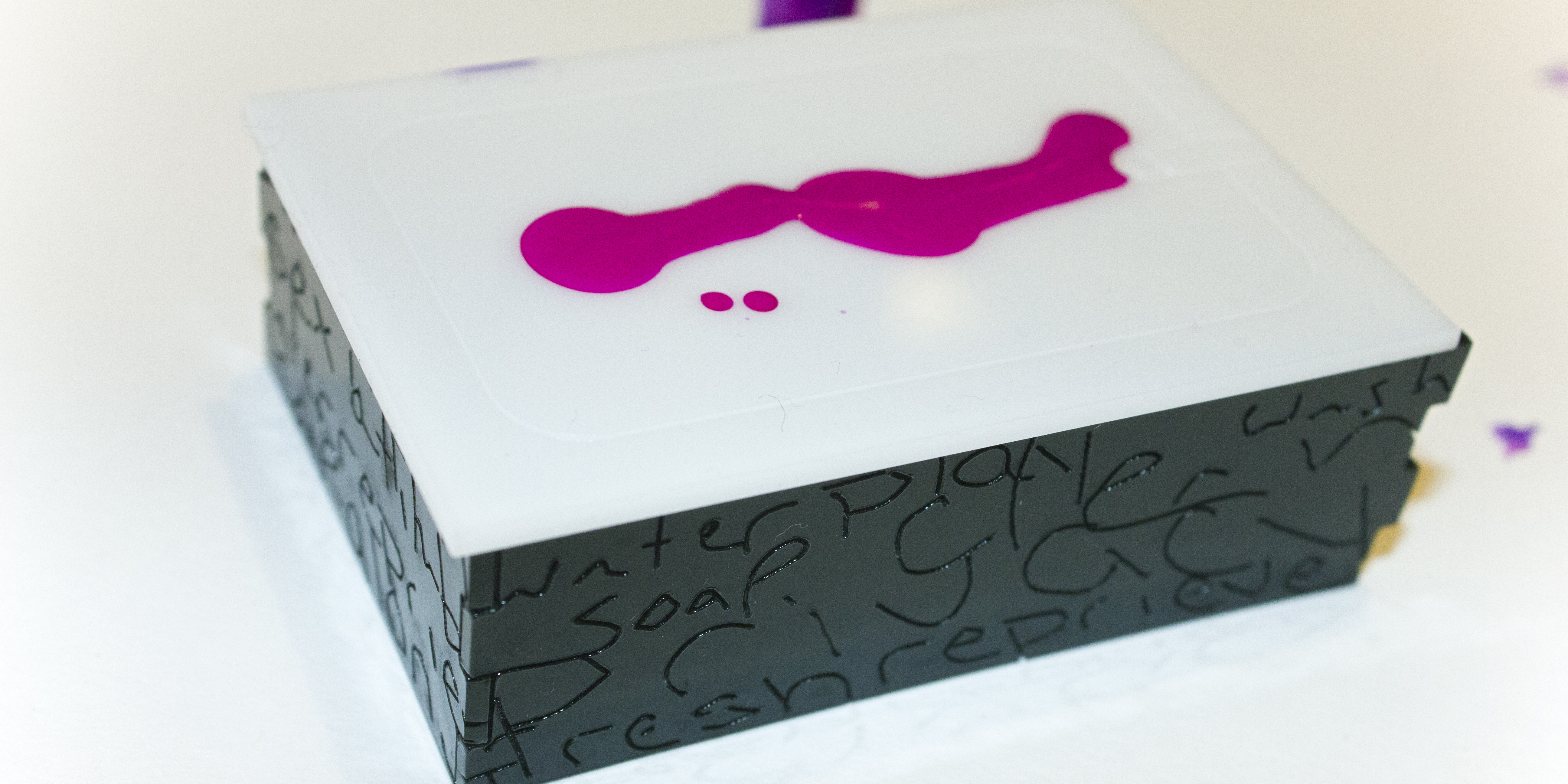
The pieces are made from 1/16″ black and white acrylic.
Using a pristine, white overview of my apartment’s layout to establish space and relation of objects to each other, I set the ground for a narrative to be created by the people who interact with that space. I begin by dripping purple acrylic paint over the scene, mapping out how I perceive my boyfriend to move through the space and I strategically draw attention to the objects he spends the most time with, especially when he’s not interacting with me. My boyfriend similarly routed where he perceived me to spend most time, using pink acrylic paint. In the end, it became obvious that (in my mind) he spends most of his time in the corner (at his desk) or on the right side of the bed. (In his mind) I spend most of my time in another room (on the couch) or on the left side of the bed. We use the kitchen and table spaces very rarely.
The next portion of my project details our more personal associations with the objects in our apartment. For each item, my boyfriend and I wrote words that came to mind when interact with it. I scanned those words in, and vectorized them in order to engrave them on the base pieces of the furniture. Words like “privacy” appear on things like our shower. My boyfriend associates his desk with simple themes such as “computer” or “internet,” while I perceive the space with words like “neglect” or “mindless” because of the amount of time he wastes there without interacting with me.
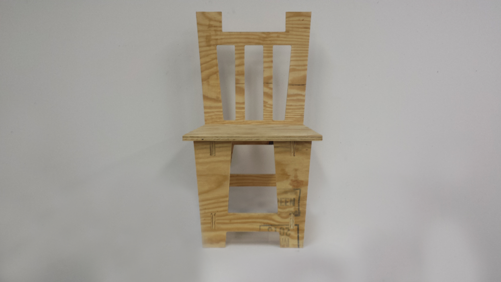
 This first prototype of my chair has assured me that the design is both functional and of reasonable size.
 The main structural integrity of the chair is fine, however the backing of the chair requires some reinforcement.
 I will probably need to place a piece of wood perpendicular to the backing of the chair on either side running down to the floor.
 The main aesthetic design is a bit different than what I had first envisioned however I really enjoy it and would like to continue to use this style.
 For my next iteration of the chair I would like to keep the form of the chair almost the same but create complex etchings and designs to the chair in order to make it seem more ornate.
 The painted prototype has also helped me envision what I would like my color scheme to be. The color also shows very nicely on camera which should make photographing the piece much easier.
 The Burnt Sienna with white accents seems to allow the chair to be a part of two different realms; a classic, adult style and a child’s room style. This can work very effectively with my upcoming altered concept.


 Visually, this chair came out the way I envisioned it, but it was not physically secure. The triangular support pieces I made did not fit correctly and I had to leave them out. I plan on making pieces to secure the legs against the table top on both sides in the next version. I will also make it so the legs do not connect all the way to the surface. This time to hide the ugly bruises of the legs sticking up, I cut another circle to place on top. I found the size of the seat and the height of the chair to work for the idea I was trying to capture. On the next version, I want to make the placement of the legs look more purposeful. I did very carefully choose where to put the legs, but it seems from the sideways view, very random. Another addition I would make is a cushion. A flat surface as a chair is not meant to be something to lounge on, but at the moment, it would be difficult to even relax with how hard the chair is.
