Simulated Nature: “MY Family Tree” by Alysia Finger (2013)

photo

My final piece, entitled “MY Family Tree”, was made using a CNC router. I used 3 sheets of .25″ Masonite with various circle cut into them to simulate the look of dividing cells. To achieve this look, I used Nervous System’s Radiolaria application to divide the “cells” corresponding to “1”s in translated binary code. Each sheet represents a member of my direct family: the red layer represents me, the black layer represents my boyfriend, and the silver layer represents my daughter. Our names and birth dates were translated into binary code and used to create the patterns in the piece. When overlaid, the audience can see some similarities and differences in our patterns. I personally appreciate the diagonal string of “0”s that runs through each of our layers. When stacked, the three distinct layers create a complex finished piece. I am able to continue to add layers to this piece as my family grows, hence, it will act as my own variation of a family tree.

This piece is meant to hang in my apartment’s living room as wall art.

I placed the work at my campus’s Biomolecular Engineering department for the in-class critique. I chose this location for a number of reasons. It was conveniently located near the classroom. It mimics the color palette of my piece. And most importantly, Biomolecular Engineering is the “purposeful manipulation of molecules of biological origin”, so the sentiment mimics my method of creating the piece, as well as the theme of the project. I very much appreciate the idea of “purposeful manipulation” in regards to a family tree. I have always hated family trees, because the family tree I grew up with was so screwed up and misleading. Biological relation means little to me because you can’t choose the family you were born into or who chose to stay a part of your family. Most of the people I would consider family wouldn’t necessary be a part of my family tree because we aren’t related by blood or even marriage. So beginning my own family tree through a piece like this is pretty meaningful, because I have purposefully placed these people in my life.

Chairs/Conversation Part 2 by Alysia Finger

Assignment,CNC Router,Technique — afinger @ 3:53 pm

1

2

3

4

5

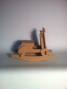
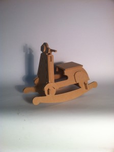
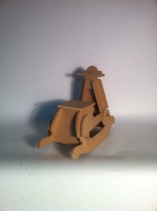
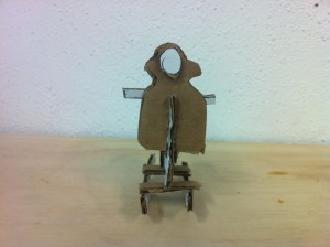
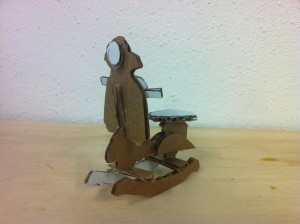
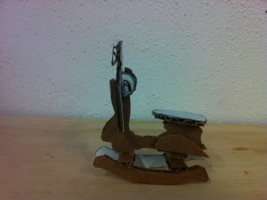
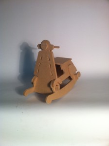
This MDF prototype of the “Rocking Vespa” turned out surprisingly functional. It can (mostly) support an adult’s weight. Though construction was difficult given all the joints, I am highly pleased with the outcome. I plan to change the design in a way that would ease assembly: eliminate some connections and widen the joint entries. I would like to round and soften the edges of the seat to improve comfort, and round the decorative pieces to improve the look. I will add two foot bars: right below the seat (above the “wheels”)  for smaller children (like my daughter) and one under the “wheels” for larger children. The handle could also use some redesign to increase strength for rough play. I hope to paint and finish the piece to make it look more like a vespa. I will make the next two models out of plywood or a stronger material to make sure it will last through multiple children and have a longer lifespan.

Chairs/Conversation Part 1 by Alysia Finger

Assignment — afinger @ 1:30 pm

photo (10)

photo (11)

photo (12)

For my chair project, I wanted to create a piece of furniture that I could get use out of after its creation, and since I have an abundance of seating for adults in my apartment already, I decided to create something for my daughter that her and her friends could use. In imagining a conversation between two children or babies, I realized that a conversation in chairs would be difficult for any child since they have such trouble sitting still. Children like to move and play – so the chair should encourage and work along with that desire to move: a rocking chair — better yet, a rocking horse! But I wanted give a different sense of adventure – horses are too rural. The idea of a vespa came to mind; it could give a new sense of adventure and exploration. Vespas are iconic to give a sense of place (Italy) but they are also advertised as an icon of freedom and youth. I have studied abroad in Italy so I have that connection, but the world as a whole is also becoming more global. Vespas were created to allow people to navigate the narrow alleyways in Italy and also allow for women to ride wearing long skirts. Vespas are now used quite often in Urban spaces in various countries. The idea of two babies conversing on an item that inspires a more adult use appeals to me. I imagine children talking about future adventures they may have. I found an example here.

photo (9)

photo (8)

photo (6)

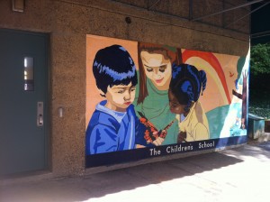
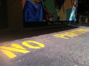
When I studied in Italy, I was excited by the amount of graffiti I saw in Milan. In fact, most store owners would commission artists to paint their garage doors, because any blank space was sure to be tagged eventually. Graffiti represents art, rebellion, youth, anarchy, identity, and a story that someone wants to tell by claiming a space. To use a chair that so closely ties to Italy, I also have to connect the location the chair would occupy. Graffiti and concrete will pull together the scene. Especially the space on my college campus that is utilized by the Children’s School. I look forward to juxtaposing inexperience youth with a scene more readily recognized as pertaining to young adults.

Imaginary Habitats: “Place, Relation, and Mind” by Alysia Finger (2013)

1

2

3

4

5

6

7

A8

9

10

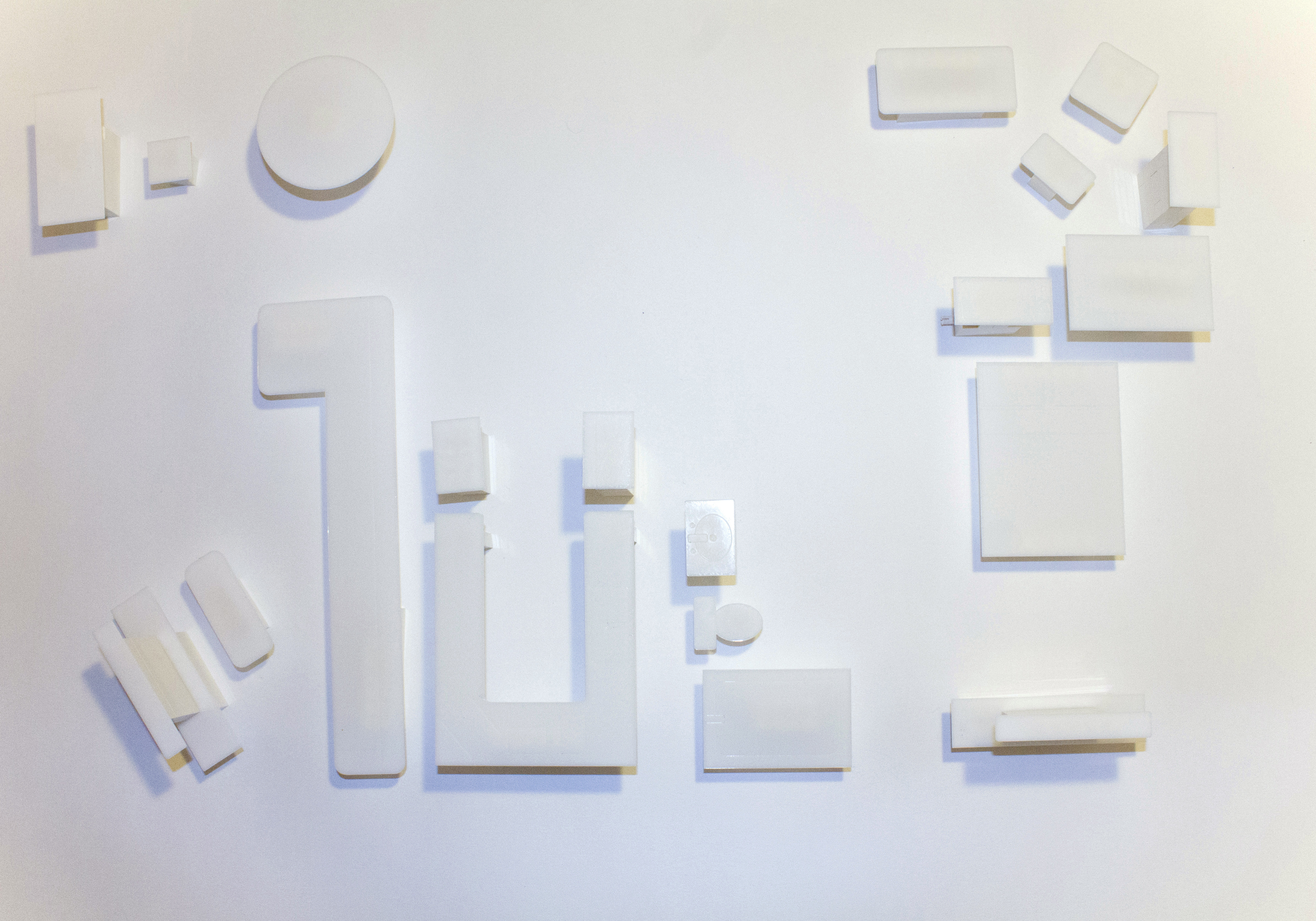
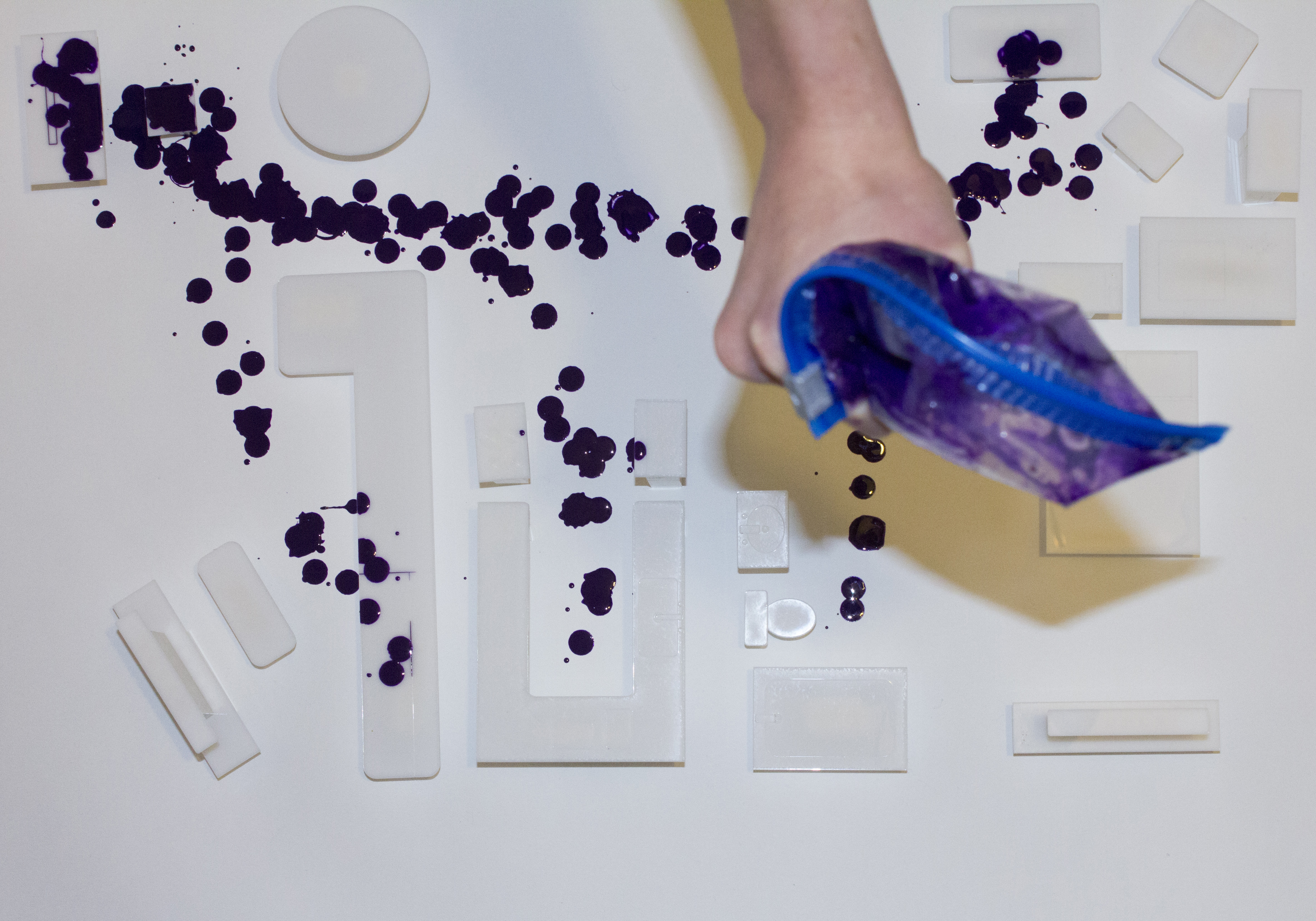
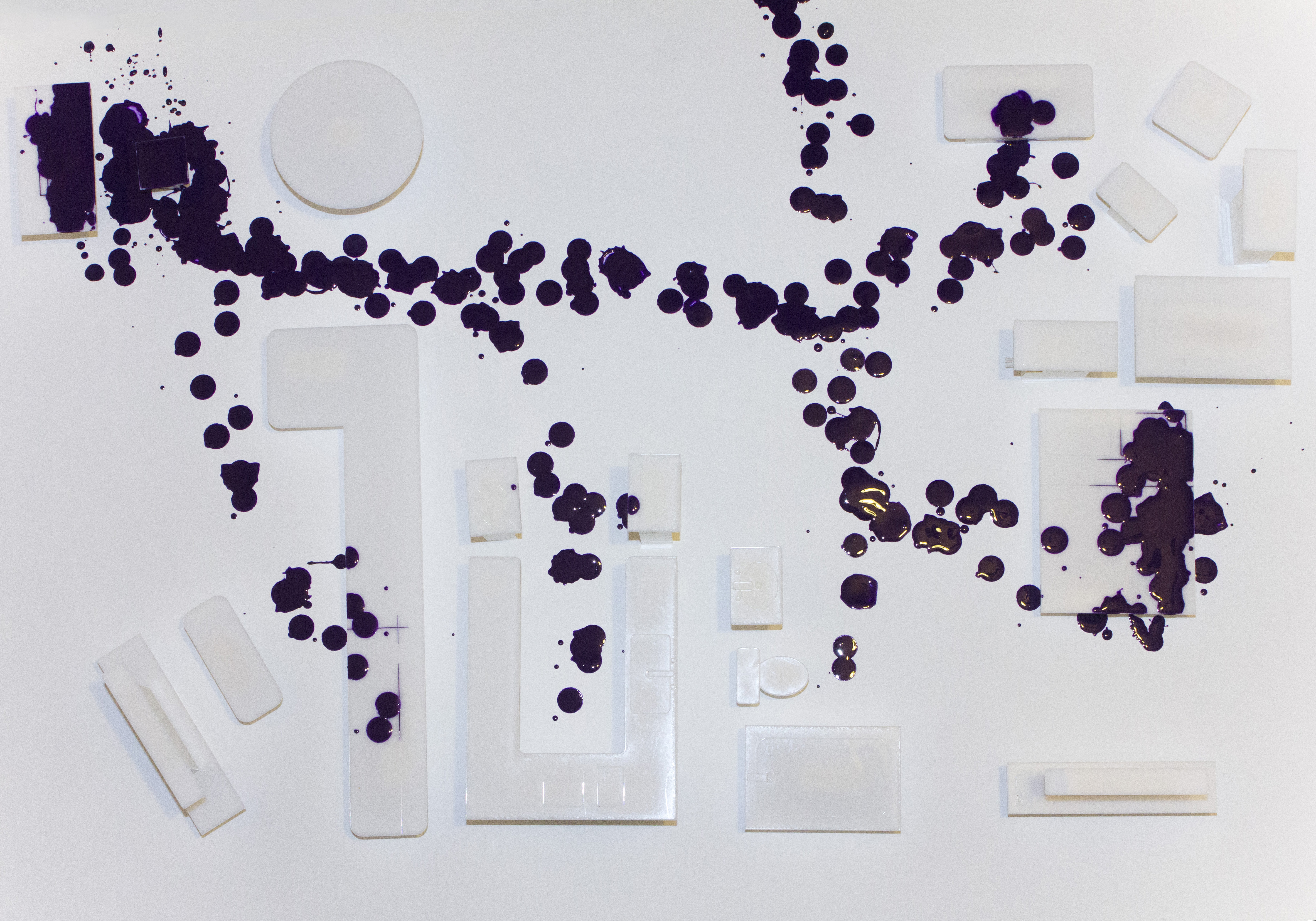
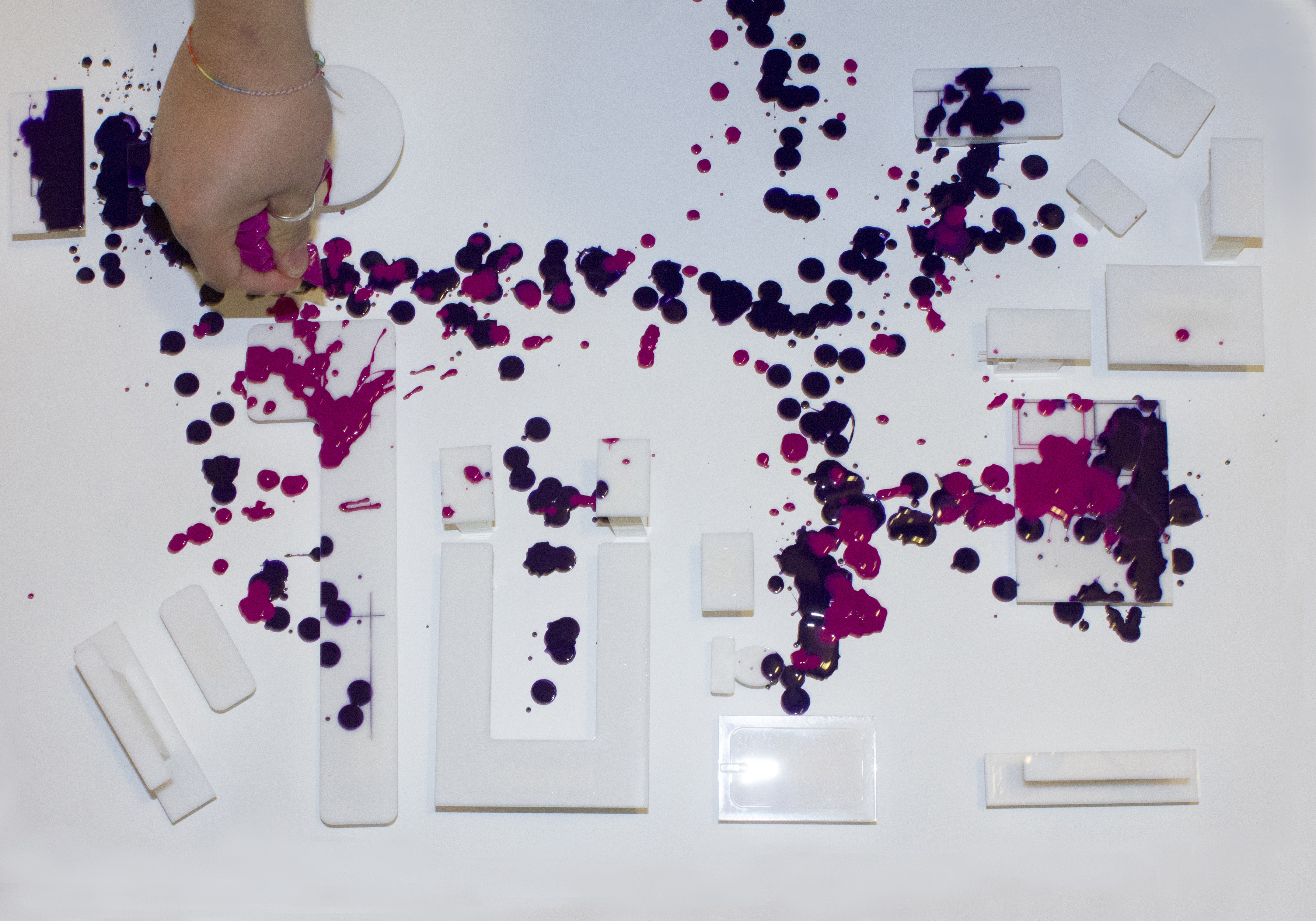
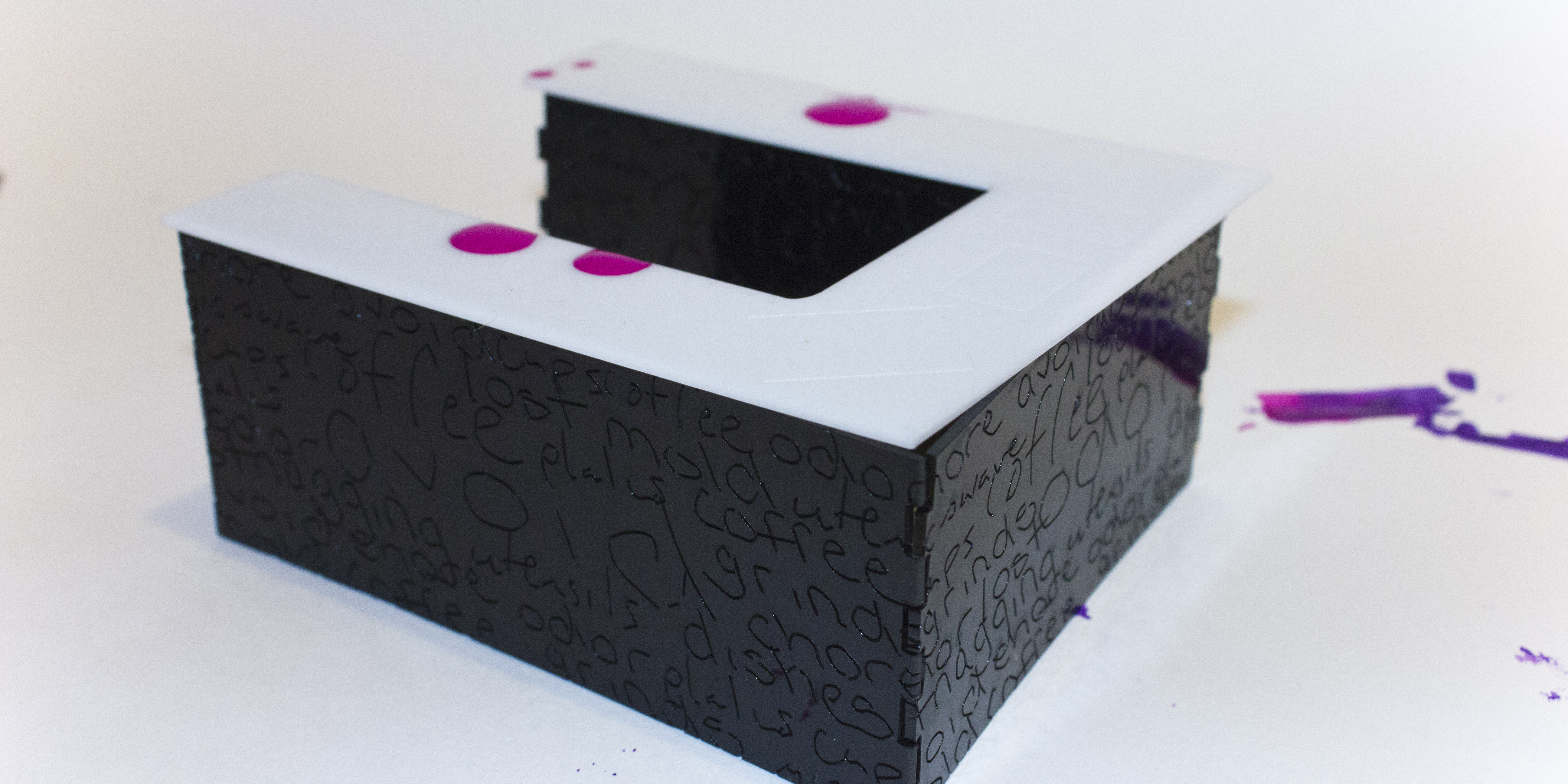
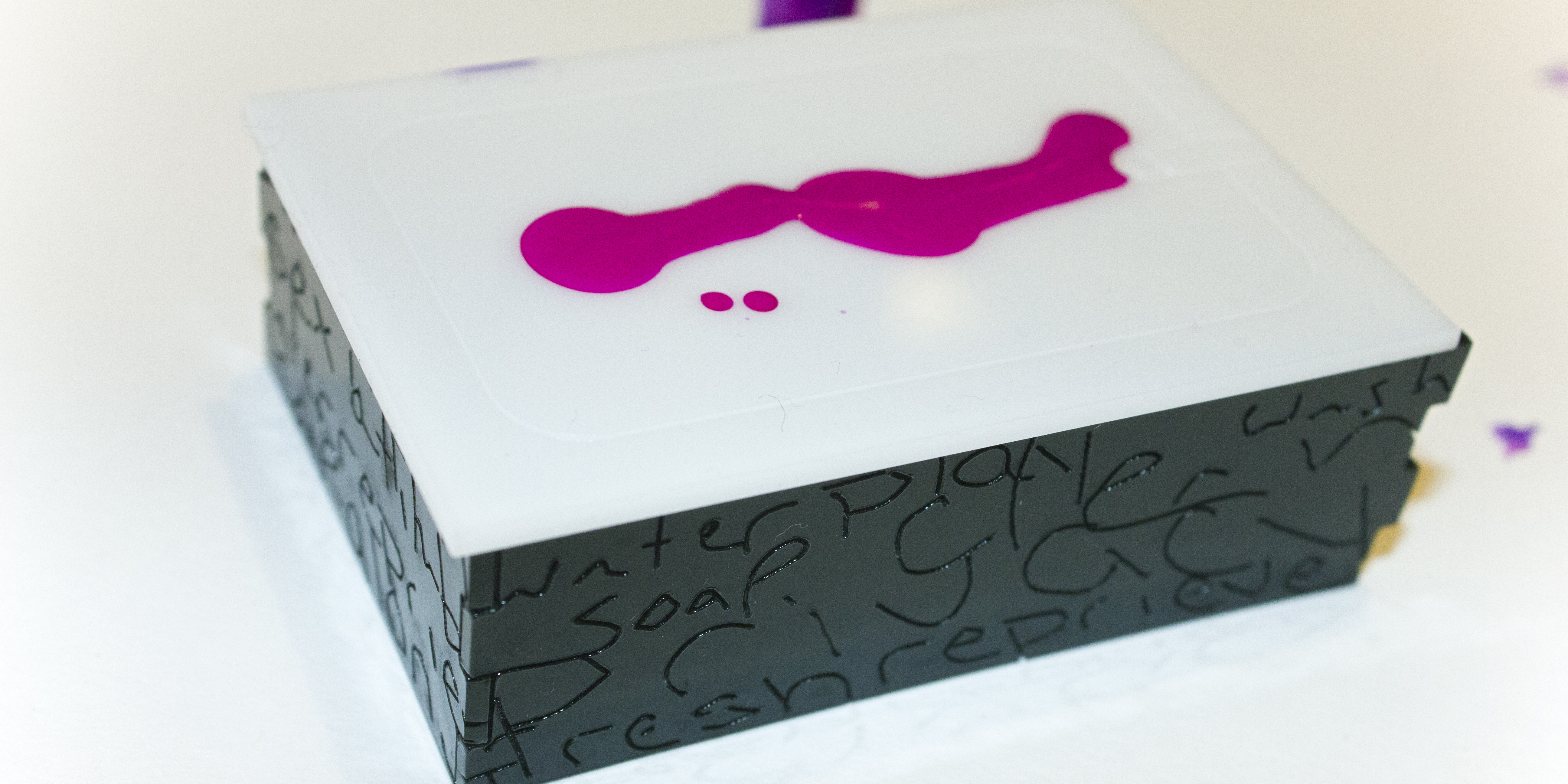
As I set out to create a story about an imaginary habitat, I wanted to focus on the idea that inhabitants are what make a habitat more than just a place. I relied on my own home environment to draw inspiration for representations of habitats and inhabitants. I focused on how people can occupy the same space in such different contexts. How do people choose to interact with a place? At the same time? At different times? While co-inhabiting, what are there relations with that space and with each other? How do they feel about a space and the objects in that space? What do they associate with those things? How do the meanings of those spaces and objects differ between people?

The pieces are made from 1/16″ black and white acrylic.

Using a pristine, white overview of my apartment’s layout to establish space and relation of objects to each other, I set the ground for a narrative to be created by the people who interact with that space. I begin by dripping purple acrylic paint over the scene, mapping out how I perceive my boyfriend to move through the space and I strategically draw attention to the objects he spends the most time with, especially when he’s not interacting with me. My boyfriend similarly routed where he perceived me to spend most time, using pink acrylic paint. In the end, it became obvious that (in my mind) he spends most of his time in the corner (at his desk) or on the right side of the bed. (In his mind) I spend most of my time in another room (on the couch) or on the left side of the bed. We use the kitchen and table spaces very rarely.

The next portion of my project details our more personal associations with the objects in our apartment. For each item, my boyfriend and I wrote words that came to mind when interact with it. I scanned those words in, and vectorized them in order to engrave them on the base pieces of the furniture. Words like “privacy” appear on things like our shower. My boyfriend associates his desk with simple themes such as “computer” or “internet,” while I perceive the space with words like “neglect” or “mindless” because of the amount of time he wastes there without interacting with me.


Imaginary Landscapes: “My House in Motherhood” by Alysia Finger (2013)

1

2

3

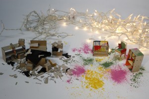
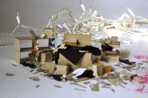
Motherhood changes everything. My house serves as an exaggerated example of what happens to one’s life when preferences and best intentions are sacrificed and what is left shows a person’s top priorities. My room is a wreck. My house is a wreck. But when I step into my daughter’s room the mess feels lighter and my nagging thoughts and “to-dos” can fade away, letting a sense of whimsy surface.

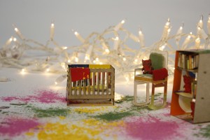
This created landscape serves to represent the stark contrast between rooms in my house. A grim, overloaded view of my bedroom trickles into a bright, colorful glimpse of the space I keep for my daughter. My bed is unkempt and my dresser left agape. Miscellaneous items ranging from shoes to coffee mugs are scattered around the base of the bed, leaving only a narrow path to enter and exit the bed. The clutter makes way to a different kind of mess. Splashes of color cover the floor and furniture of my daughter’s room, representing the youth and creativity felt when in the presence of small children.

There are 135 pieces total in this scene, 115 in my room, and 20 in my daughter’s. My pre-pregnancy weight was 135 lbs; I lost 20 lbs after giving birth; and I am left at 115 lbs. Each small object in the rooms come in multiples of three. Three is a pretty wonderful number aesthetically, but it is also representative of the number of people that make up my family. More importantly, three is the number of comfort dolls I bought for my daughter before she was born. I heard that children get upset if they lose their favorite toy, so it is best to have an extra — I bought two extras to be prepared. We now have three “Boo”s (tiny monster dolls) in my house so my daughter never gets lonely.

My choice of materials brings the viewer back to a sense of sacrifice: cereal boxes and frozen dinner boxes are used for the boards, and old bras that no longer fit my changed body are used for the fabric. I have given up my intentions to make fresh, home cooked meals for my family, leaving me with a near endless supply of food packaging. My body has changed so drastically that I feel I will never go back to my old shape, thus those bras become useless to me.

The choice of a white background gives the audience a surreal sense of focus on the items in this landscape. The christmas lights in the back create a common thread throughout the piece, contributing to additional spontaneity to my daughter’s room while contributing even more clutter in my room. Christmas lights lend themselves to a feeling of home and family, and they are also the primary source of lighting in my low-budget home.

I wanted to share my feelings of frustration and confusion with what certain aspects of my environment and routine have become, but I also wanted to take them on the reprieve I get when playing with my 10-month-old daughter, who brings a new and fantastic sort of chaos to my life.

Laser Cutter Example: “Tinysaur” by Herbert Hoover (2013)

Artists,Laser Cutter,Reference,Technique — afinger @ 1:35 am

Tinysaur: The Tiny Human Skeleton


Herbert Hoover has been a sculpture artist for 20 years. His work is included in a permanent collection at the Cooper Hewitt National Design Museum. He often creates 3D model dinosaur skeletons using a laser cutter, and by request has begun working on prototypes for “human-dinosaur” models.

More…

Laser Cutter Example: “Tardis” by Tim O’Brien (2011)

Artists,Laser Cutter,Reference,Technique — afinger @ 1:34 am

Last cut Tardis

I am a sucker for Doctor Who, and apparently so is Tim O’Brien. He has posted a few laser cut projects to thingiverse.com, a site that provides DIY project instructions, and many of his projects involve Dr. Who’s Tardis. This cardboard Tardis is fantastic, as he paid close attention to detail and demonstrated using joints as well as etching in other visual elements. He provides the file and instructions for this if interested.

More…

Laser Cutter Example: “FILM Typography Installation” by Teags Humm (2012)

Artists,Laser Cutter,Reference,Technique — afinger @ 1:34 am

Laser Cut Acylic

Teags Humm created this piece as a typography installation for class. This project is a student work intended for use at an event such as the Melbourne International Film Festival. Orange, yellow, and blue acrylic were combined for this flashy layered look. Small transparent rods and placed in holes cut from the geometric shapes in order to stack pieces that finally read “FILM”. The piece was cut at Melbourne Laser Cutter, a professional service for designers and small businesses.

More…

This work is licensed under a Creative Commons Attribution-Noncommercial-Share Alike 3.0 Unported License.
(c) 2024 Hey Robot, Let's Make Something! | powered by WordPress with Barecity