Instrument of Persuasion: “Unreasonable Reasons” by Natalie Moss (2013)

IMG_2185

IMG_2186

IMG_2189

butwewantareason3

tobeunreasonable3

IMG_2178 - Version 2

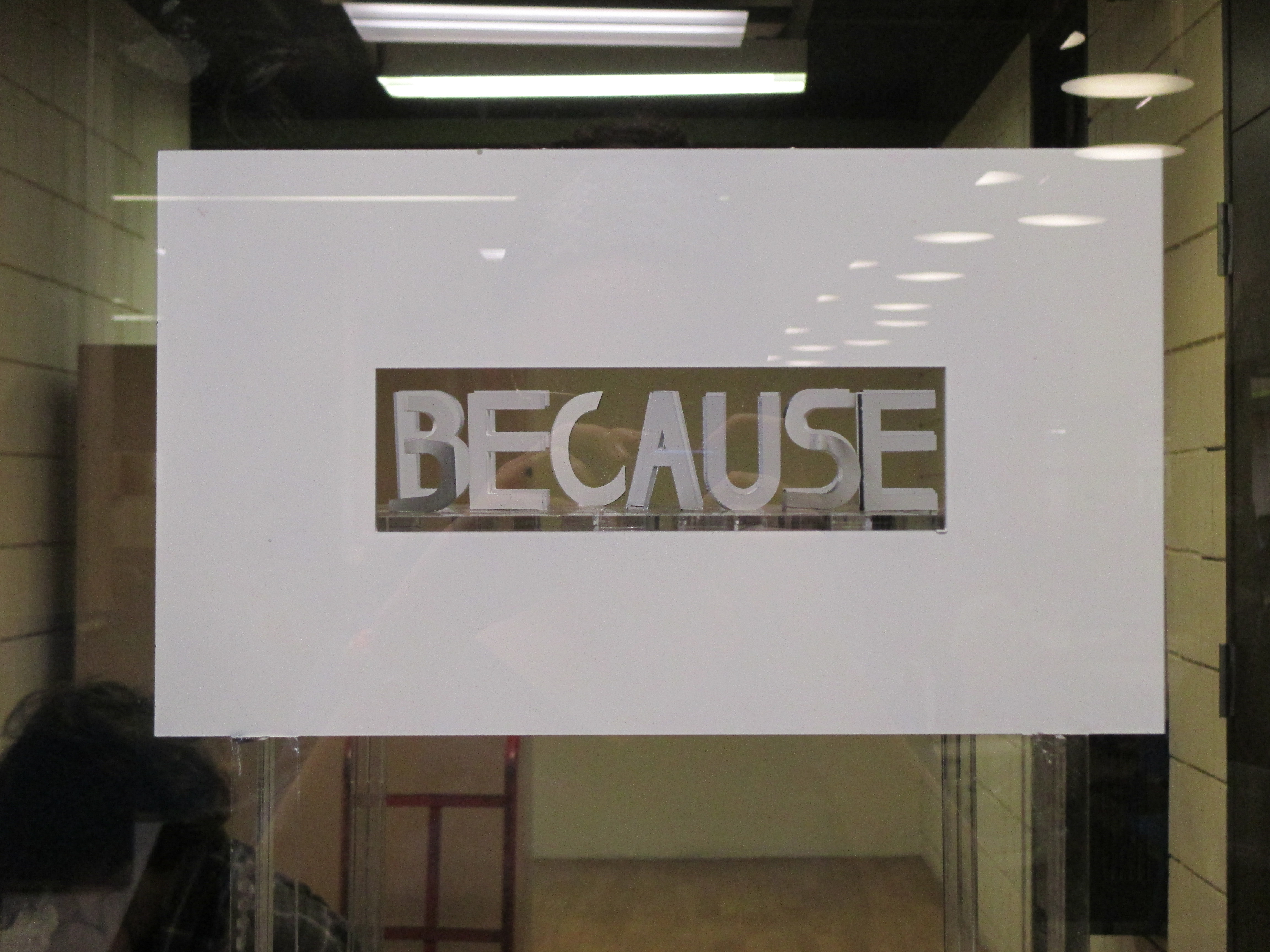
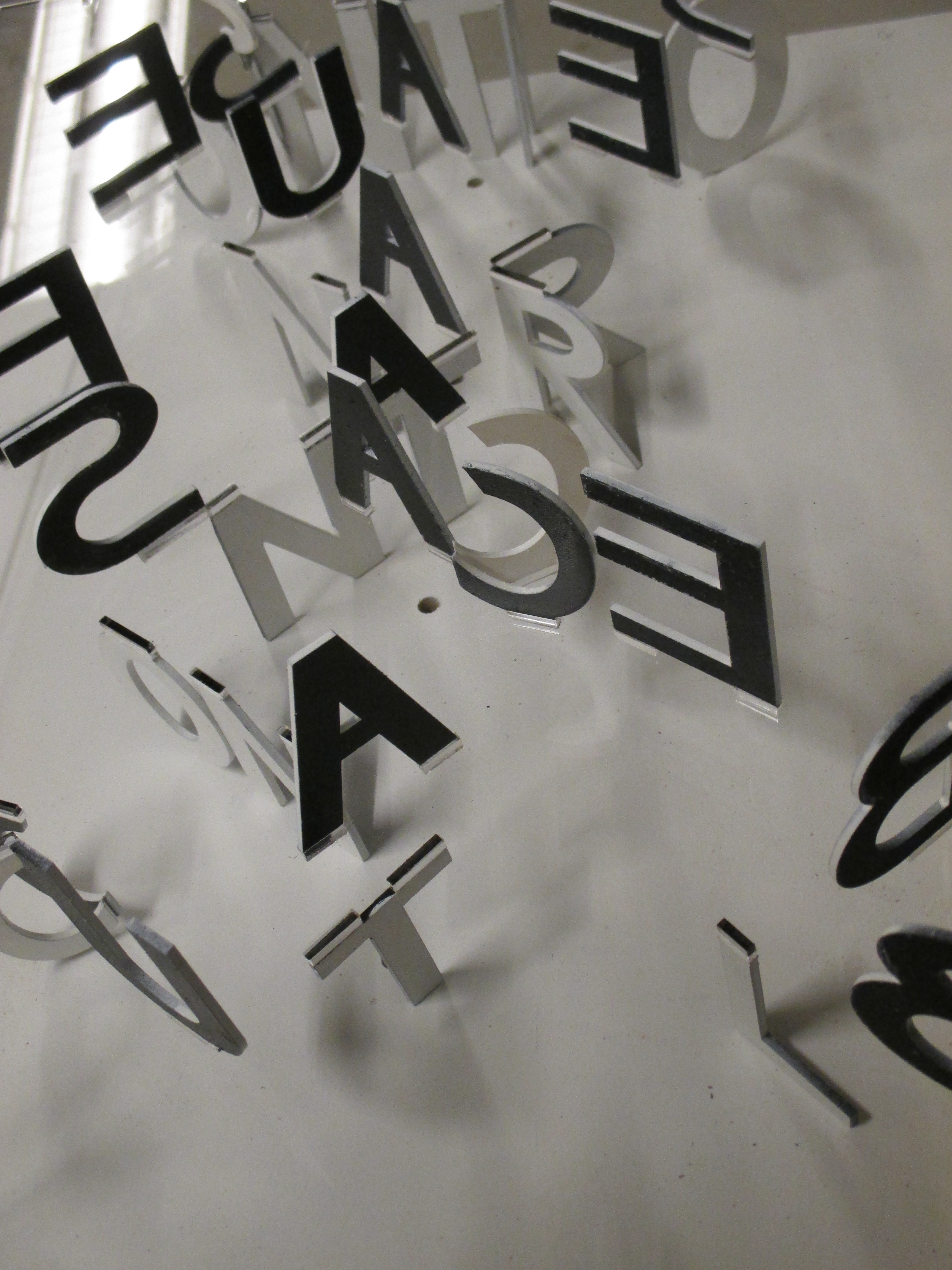
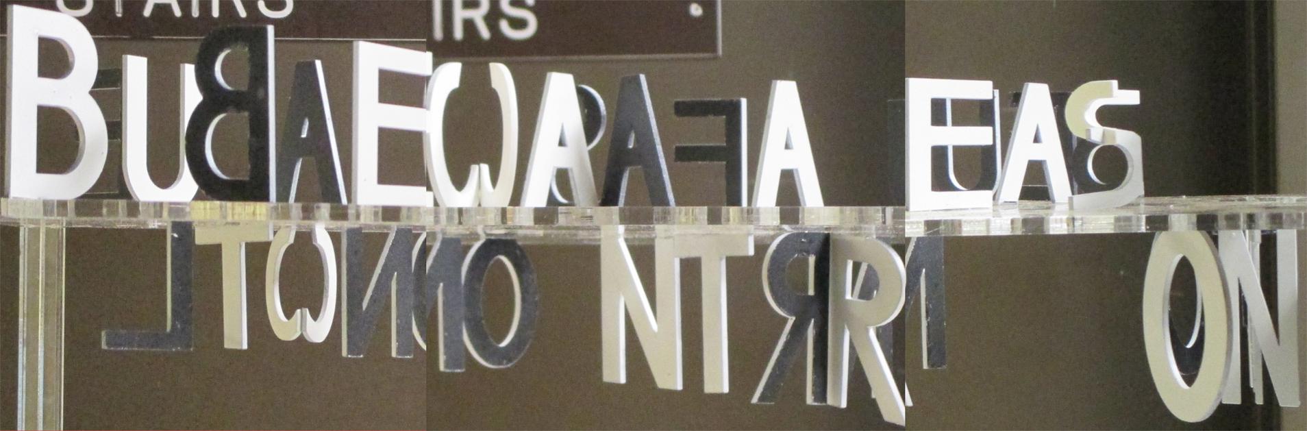
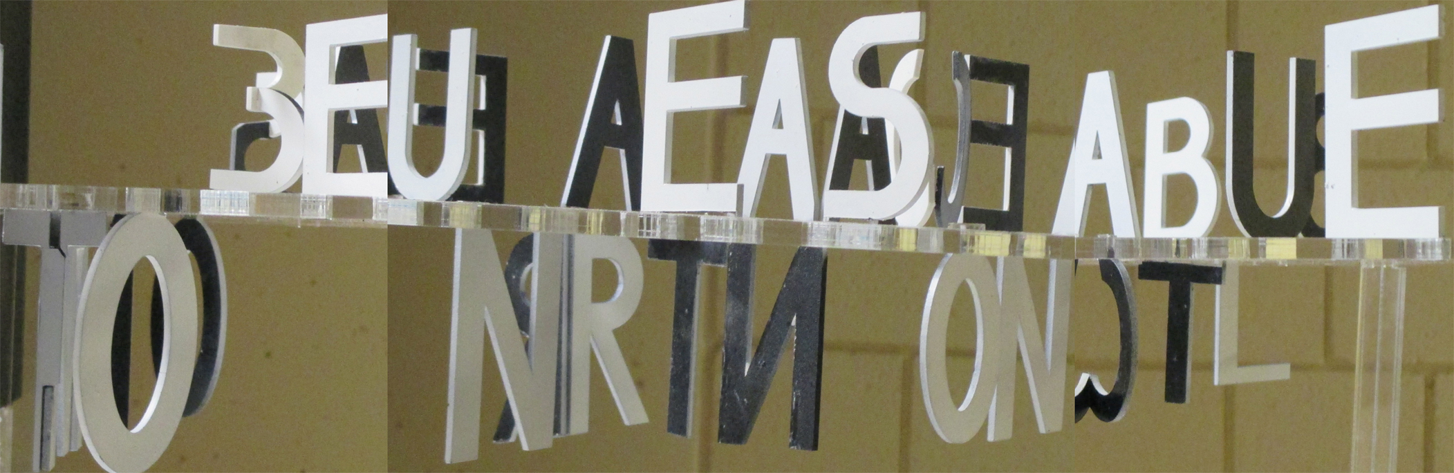
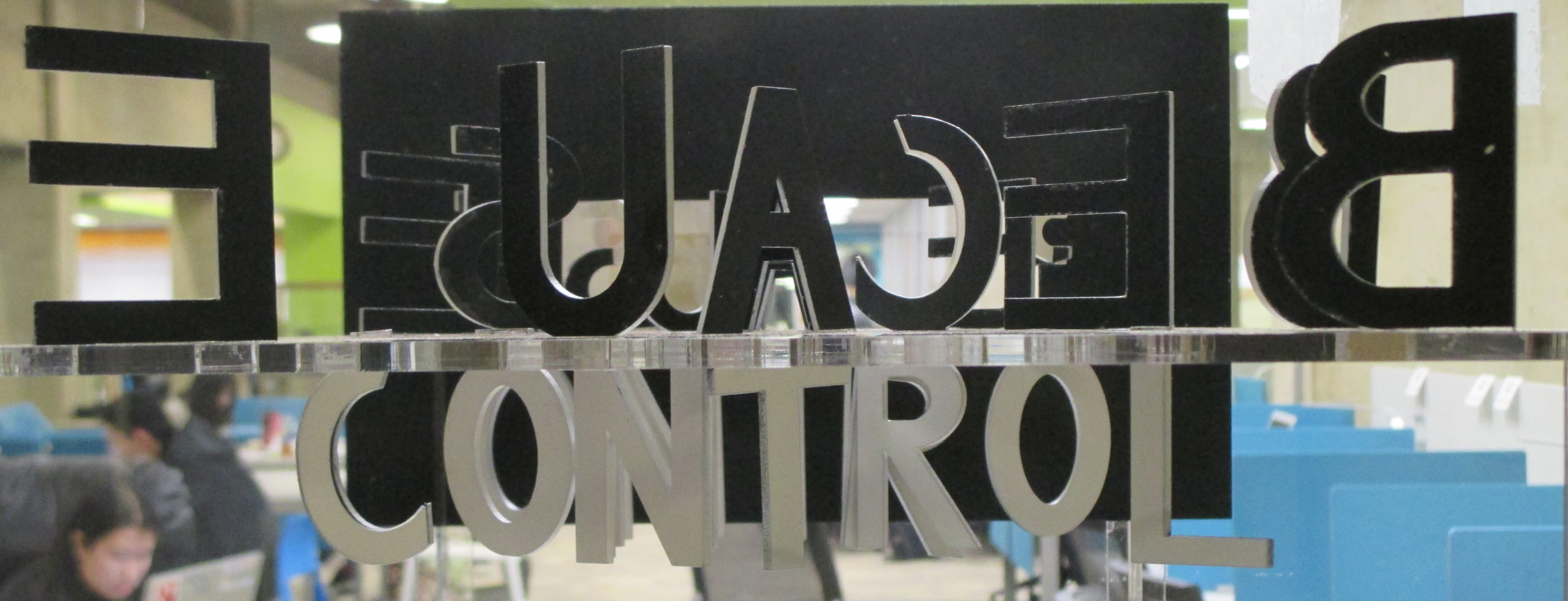
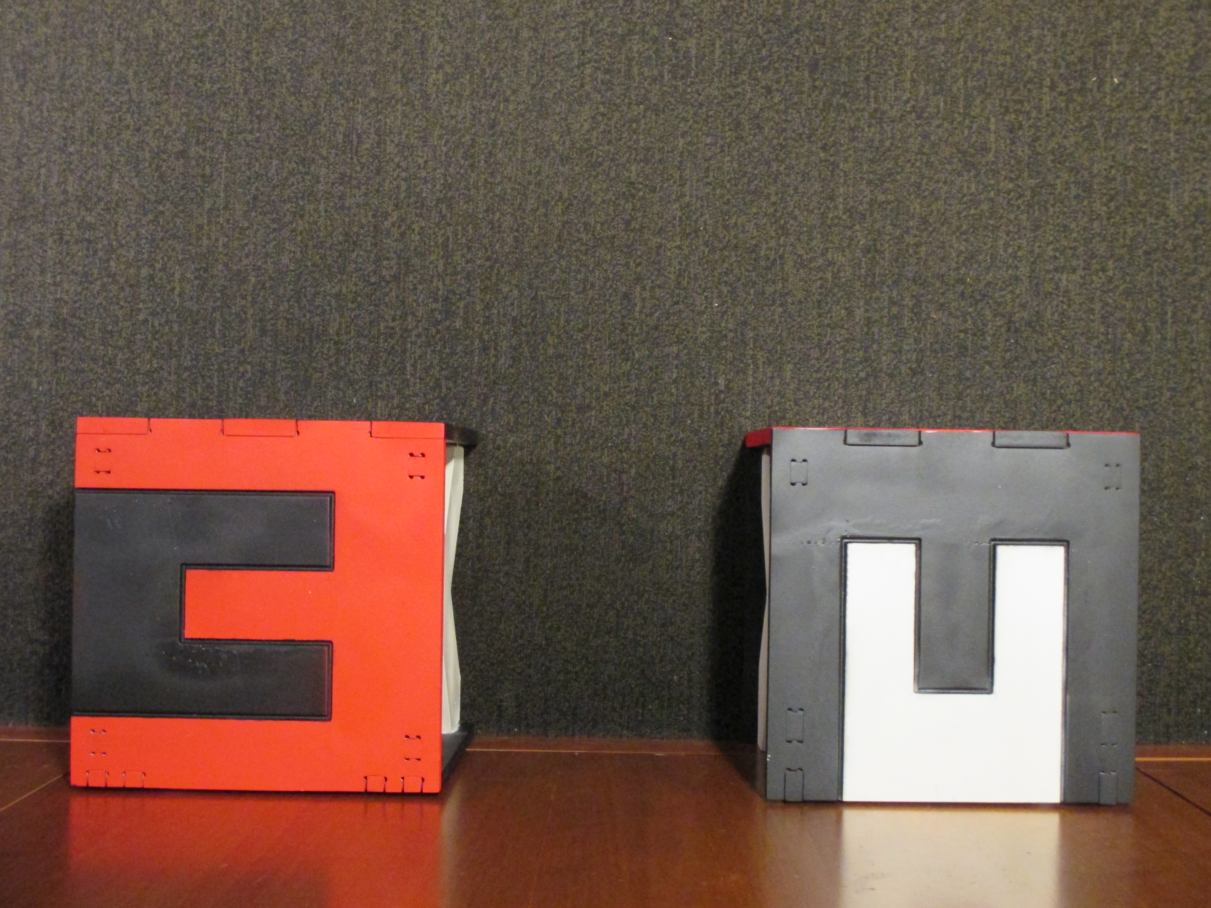
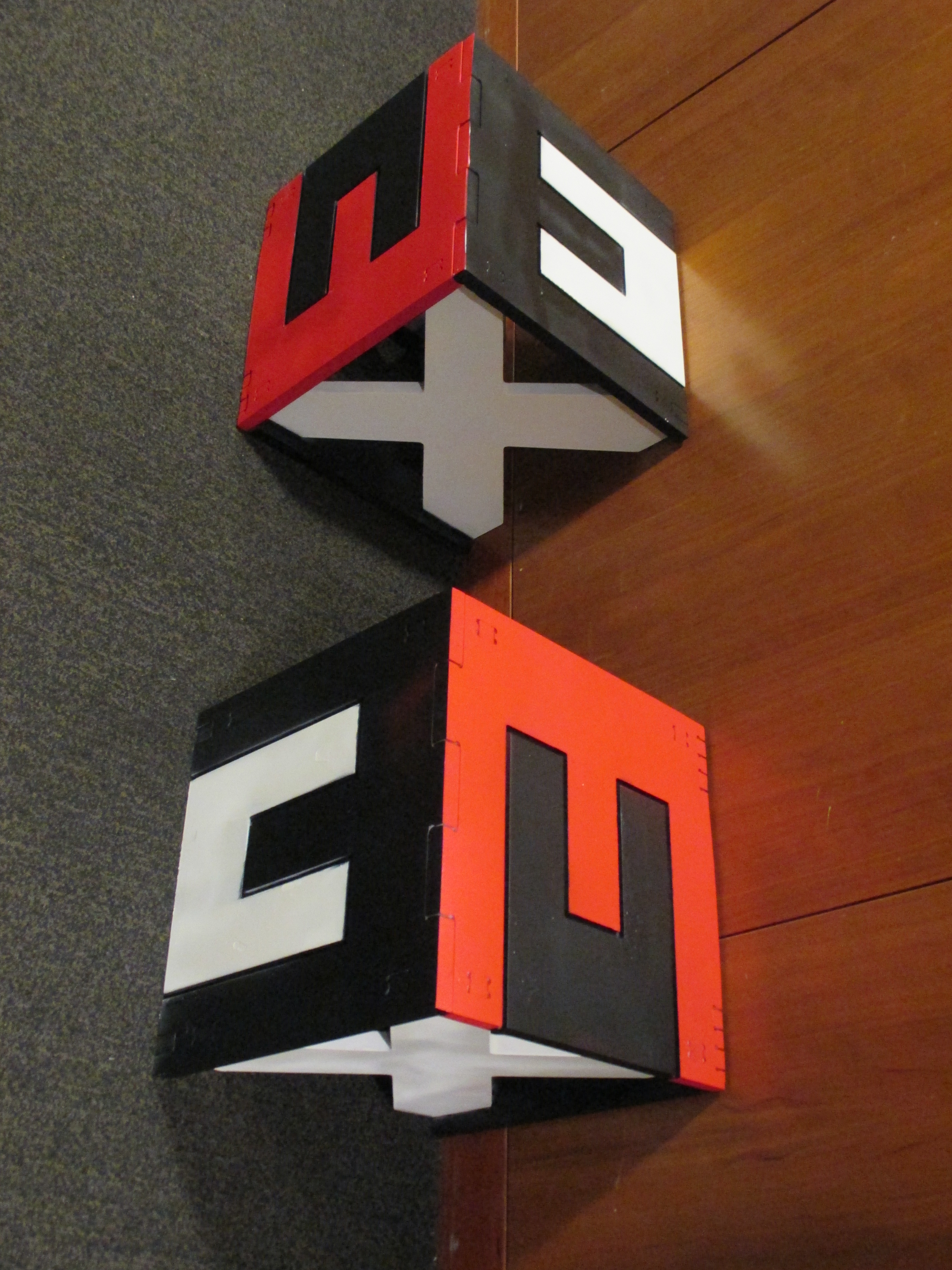
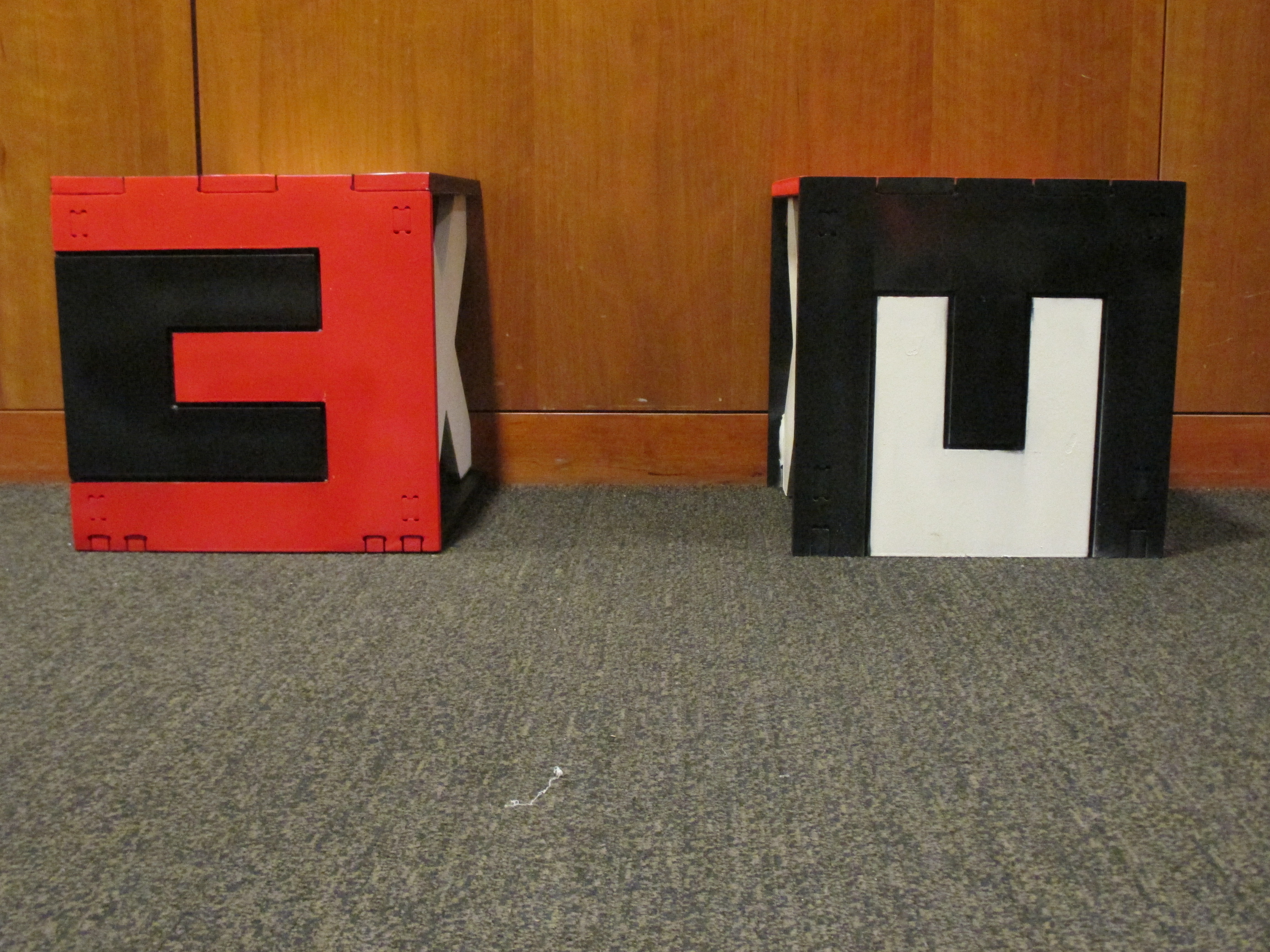
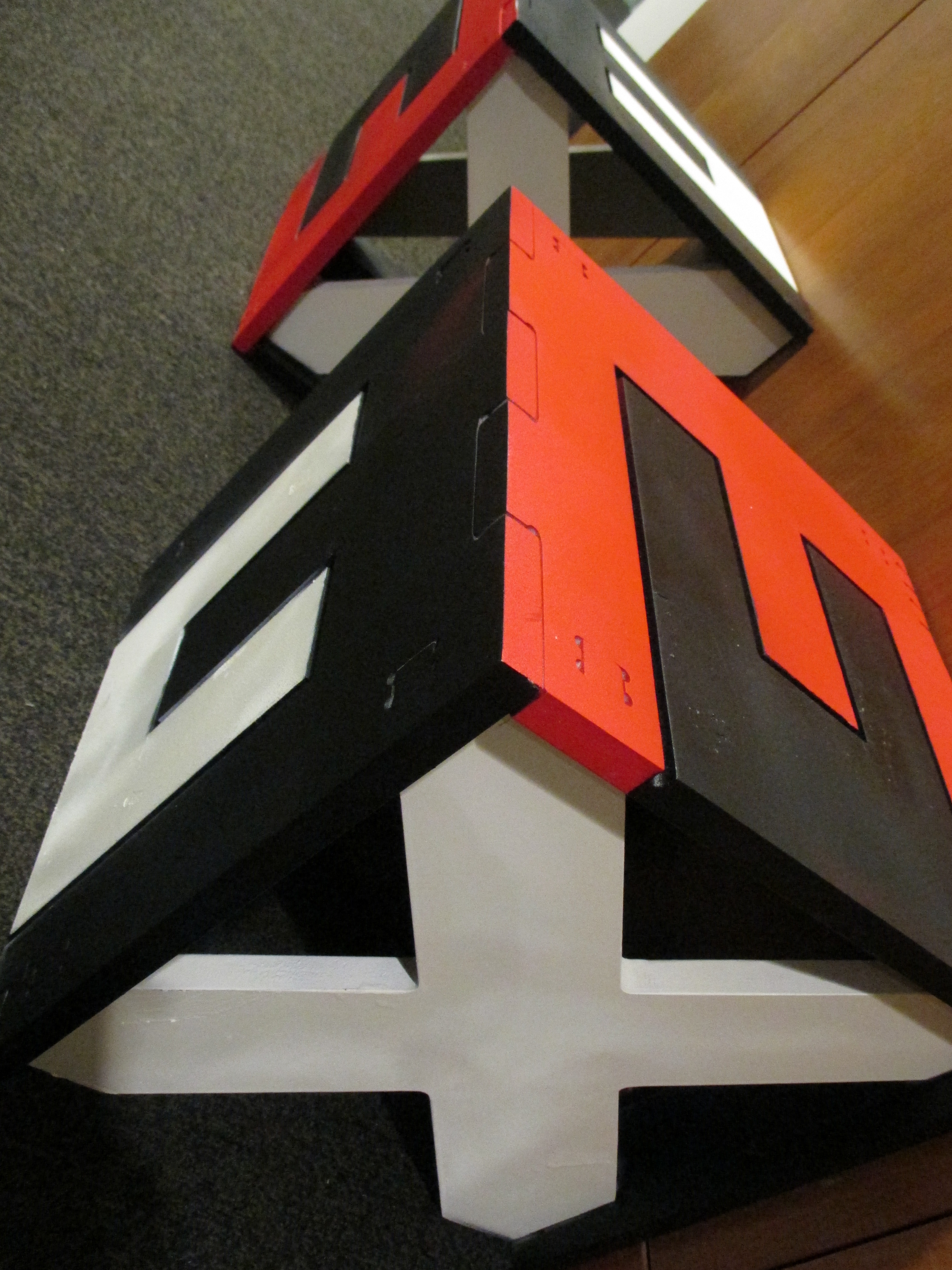
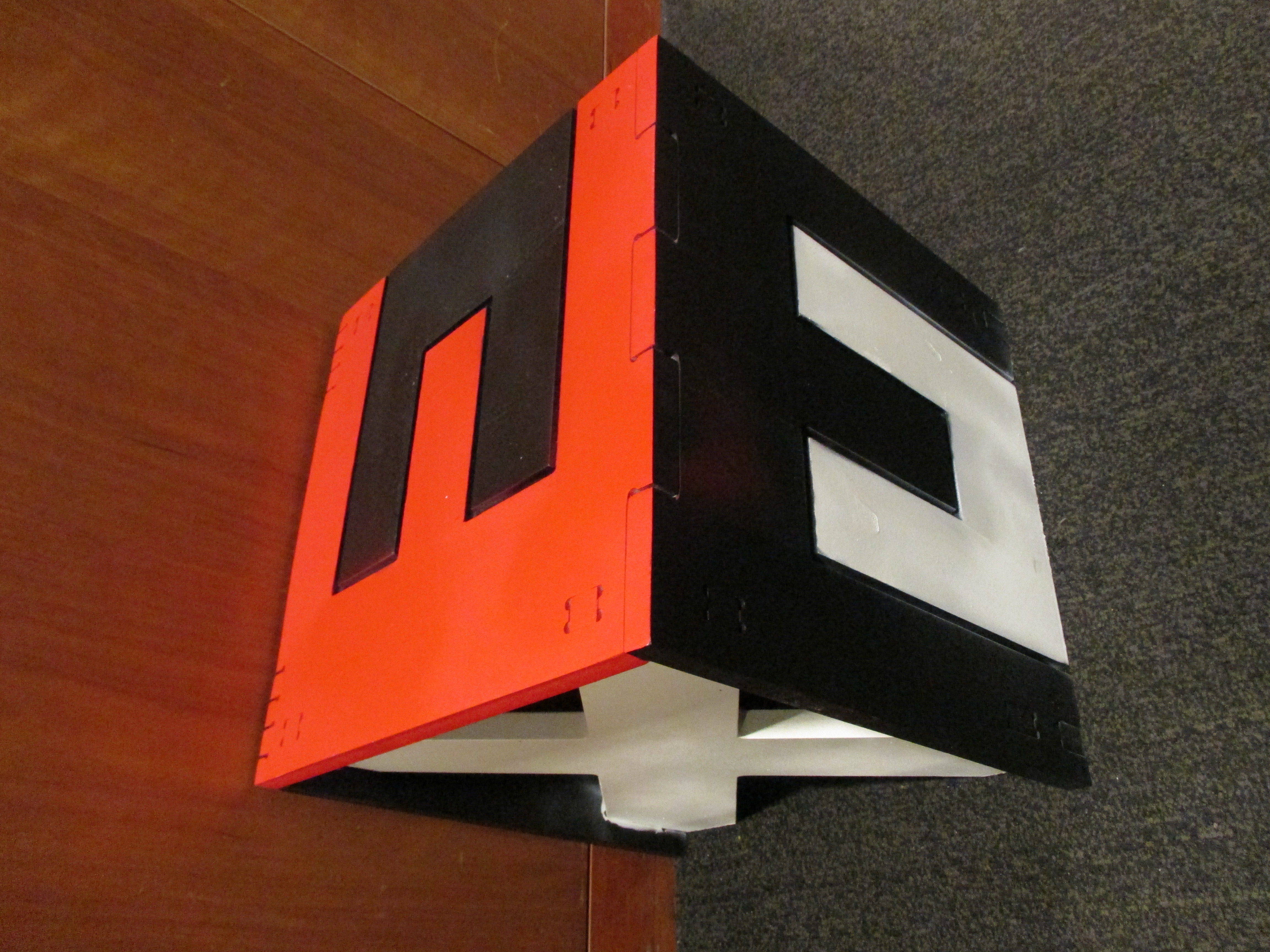
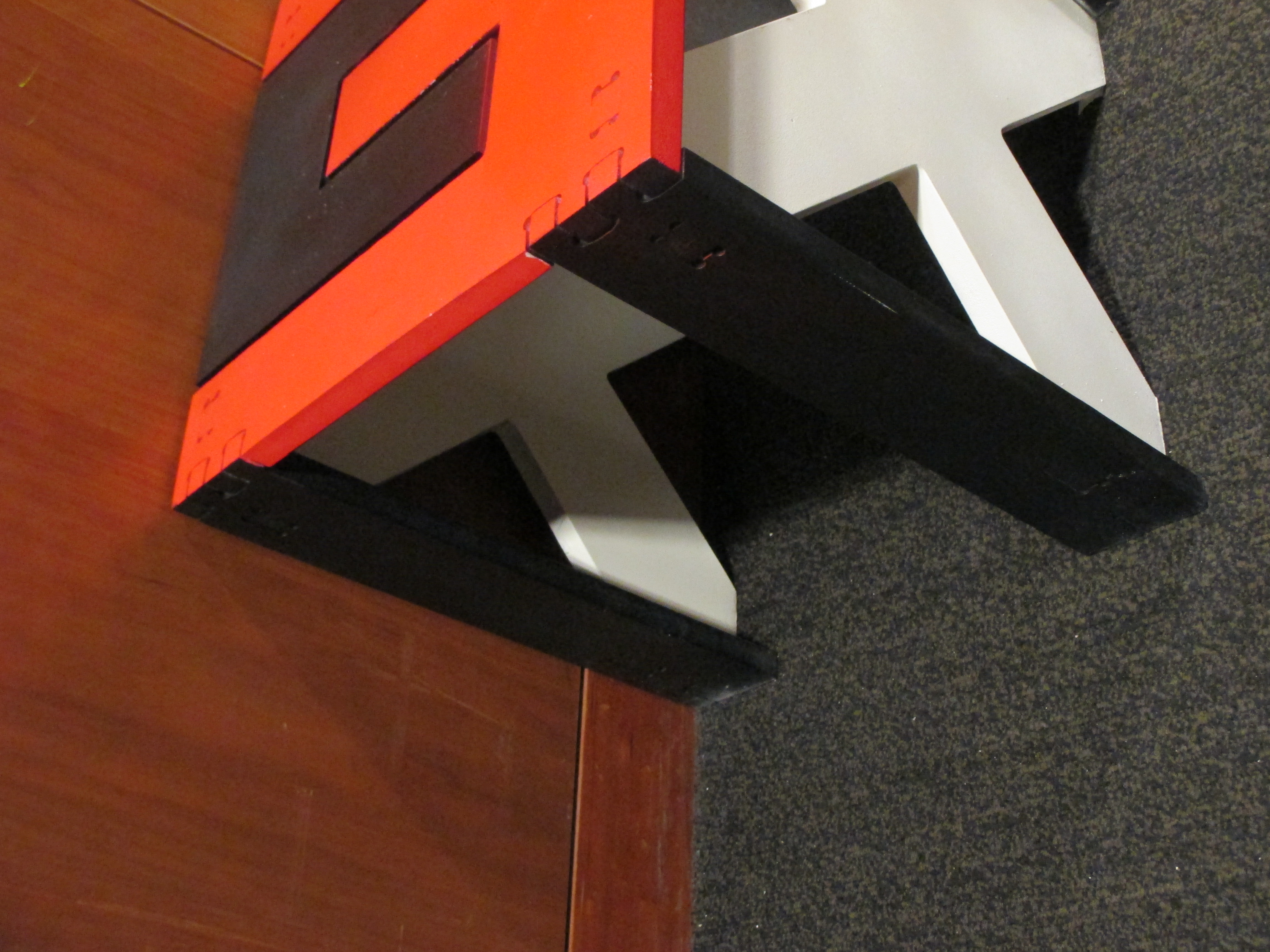
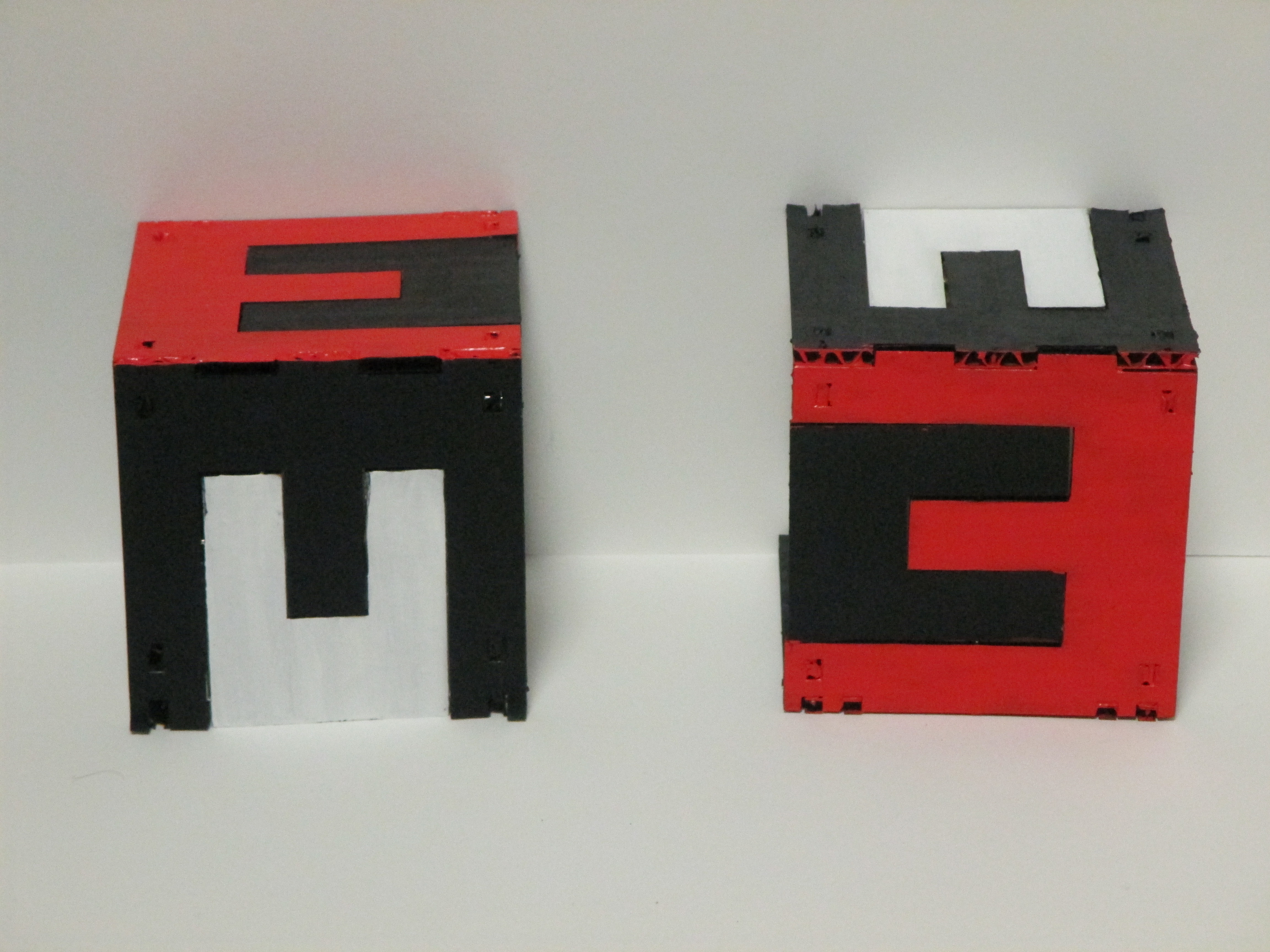
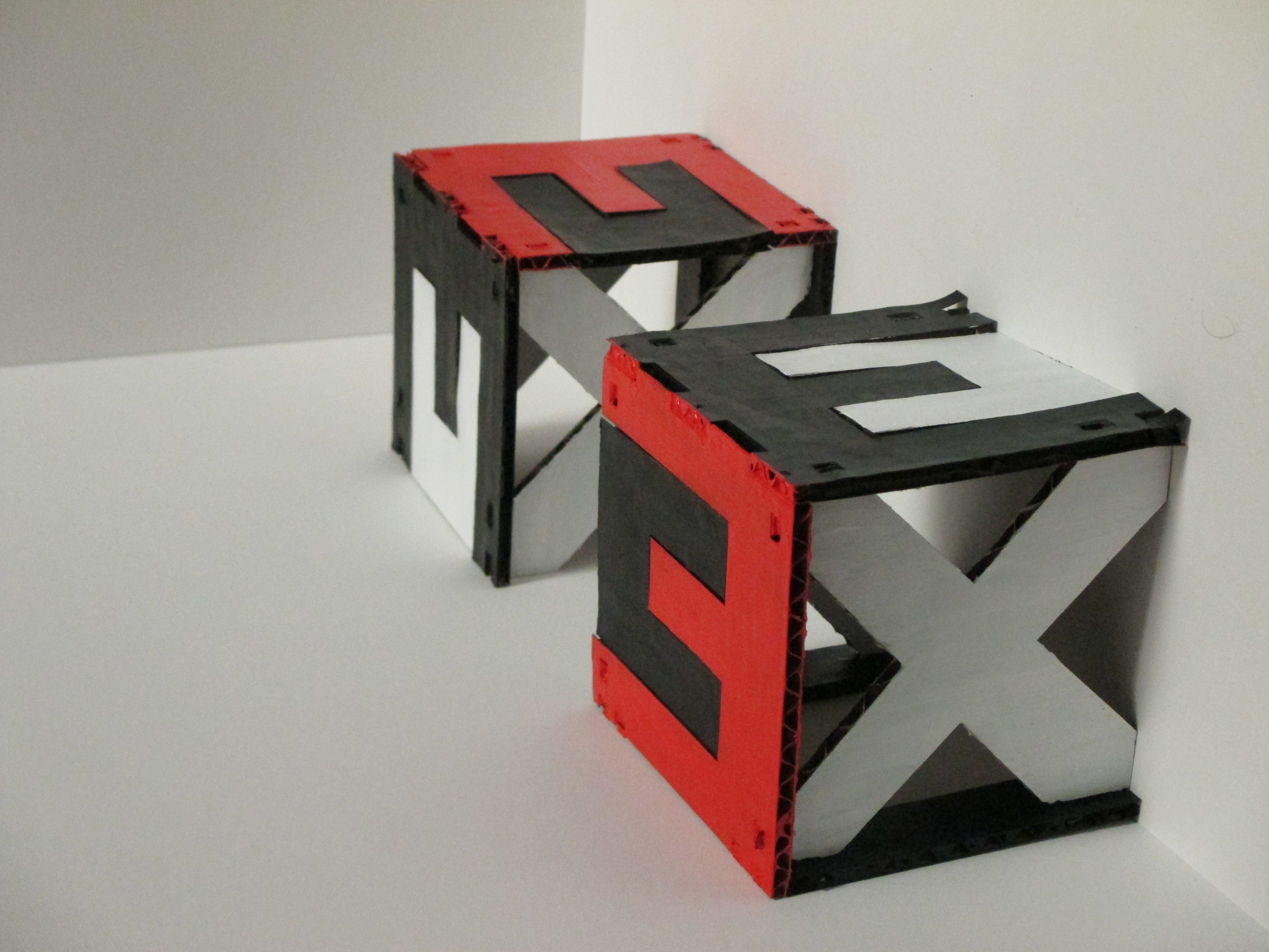
“Unreasonable Reasons” was inspired by a psychology experiment in which the word “because” was shown to have the power to persuade people even when paired with an unreasonable reason, in tandem with the prompt “instrument of persuasion.” The word “because” is displayed behind a glass window in a library, where people tend to trust in words and take them at face value. If the viewer is to see the rest of the piece, it is necessary to walk a long and roundabout path to reach the other side of the glass. Even then, it is difficult to comprehend all of what the words which appear from other angles mean, or even to see some of them in the first place. Most viewers would likely not choose, or even think, to make the trip, and those who did would quite possibly not see the full message. This arrangement is a metaphor for the way such commonplace persuasive words are treated. Many people do not realize their impact, and those who are told (including myself, on occasion) often think on the notion briefly and then proceed to treat words as they always have, rather than putting in the effort to comprehend the full impact of the ability to persuade with unreasonable reasons. The side views, which are most difficult to read, say “but we want a reason” and “to be unreasonable;” the back reads “control,” which was eerily enough the word which resulted from the letters in the side phrases that were not in “because” (with the exception of w, which I eventually transformed into a C/W hybrid). Control fits as a culminative phrase, however, because the piece is about the control words have over how we think, to the extent that we don’t even think about or realize that control.

A thank you to Ben for helping me set up the piece for photos, to Ali for helping me find the pedestal, and to the various people whose names I don’t know who held doors for me while I was transporting this piece.

Two Chairs/Conversation Part 2: “Relativity” by Natalie Moss (2013)

CNC Router,Student Work — nsmoss @ 3:04 am

a IMG_1968

b IMG_1967

c IMG_1965

d IMG_1973

e IMG_1975

f IMG_1978

g IMG_1955

h IMG_1964

“Relativity” is inspired by the idea of a conversation between Albert Einstein and M. C. Escher about relativity. The chairs are constructed from the symbols of Einstein’s equation for special relativity (in the expanded form of E=MxCxC), are assembled in a manner reminiscent of Escher’s tessellations, and are displayed in a way inspired by Escher’s multi-perspective images. (For more detail, see the explanation in Two Chairs and a Conversation Part 1: “Relativity.”) This conversation interests me because it raises questions about what is true: according to both Einstein and Escher, a situation (event(s) + location) can be viewed in very different ways, and yet no one perspective is more valid than any other. I find this extraordinary. An individual’s perception of reality is limited to a single perspective. But all individuals see the world differently. As humans, we have a tendency to believe that our own way of looking at things is best. I think there is enormous potential in the realization that there are other frames of reference… and they may all be just as true as ours.

Thank you so much to Amanda and Zach for not only demonstrating my chairs’ frames of reference, but also for carrying said chairs to location in Gates. And then back again. You are both awesome. Thanks.

Two Chairs and a Conversation Part 1: “Relativity” by Natalie Moss (2013)

Laser Cutter,Student Work — nsmoss @ 7:49 am

IMG_1839

IMG_1842

IMG_1843

IMG_1833

IMG_1834

IMG_1835


These chairs and this location are the setting for a conversation between Albert Einstein and M. C. Escher on the subject of relativity and frames of reference. I have always loved Escher’s work, and been fascinated by special relativity, but I have only recently realized their connection. This piece reflects my own views on the many possible correct ways of looking at the world. Albert Einstein is famous for his equation e = mc^2, a description of the relation between mass and energy based on the constant speed of light in a vacuum, which is a prediction of his theory of special relativity. (It is important to note that the idea of general relativity, the fact that all inertial reference frames are equally valid, was introduces by Galileo, not Einstein.) M. C. Escher is well known for his drawings which play with relativity and multiple frames of reference, such as “Relativity” (the one with the staircases) and his tessellations, in which perspective can determine what forms are seen. To acknowledge both men’s creative accomplishments relating to relativity, my chairs are designed using the characters of Einstein’s equation in tessellating form, in which the E turned on its side is an M, there are two smaller Cs, two multiplication signs, and an equal sign. The colors are drawn from Escher’s typical tessellation color scheme of black, white, and red. The red is reserved for the two Es, as they coincide with the conversationalists’ last initials. E, M, and C also happen to be Escher’s full initials. The site is chosen for its directional ambiguity and for the fact that it is in Gates, a building infamous for its dearth of right angles, which are our culture’s favored source of referential frames.

My research included the book M. C. Escher: Visions of Symmetry by Doris Schattschneider, M. C. Escher by TASCHEN, and Einstein’s Dreams by Alex Lightman (and a thank you to Kaitlin for the referral).

Imaginary Landscapes: “The Seedling” by Natalie Moss (2013)

Laser Cutter,Student Work — nsmoss @ 5:11 pm

IMG_8922

IMG_8906

IMG_8907

IMG_8913

IMG_8915

IMG_8918

IMG_8919

IMG_8906


“The Seedling” tells the tale of the life cycle of a world, beginning and ending with a small circular seed which represents the potential for life. As the world grows, ages and dies, it moves through several stages: the plant stage, the plant and people stage (people represented by their buildings and cities), the people stage (which could also be called post-plant), and the post-people stage. Plants and buildings evolve from page to page. Because civilization is part of the same continuum as nature, rather than being opposed to it, they are represented with artistic styles unified by their focus on the circle. The entire piece is constructed in the form of a semi-circular pop-up book. The repetition of circles is meant to metaphorically reference many round or cycling forms: planets, seeds, the universe, the cycle of seasons, the cycle of a day, and the cycle of life. Just like a planet, however, only half of the circle is ever in full light, though the half in shadow can be seen as each layer of paper casts its form on the layer beyond.

This piece uses 98 pieces. It is focused on the number seven, which was inspired by the Biblical story of creation in which the world was created in seven days. This world is not only born but also lives and dies in seven pages, the last page reverting it to its original seed-like form. Since the metaphorical circle is divided in two, seven is raised to the power of two and multiplied by two to obtain the total number of pieces. Also, if the pieces which form the title on the cover are not included, there are 77 pieces, which is literally two sevens written next to each other.

Paper was chosen mostly for its practical and aesthetic aspects–foldability and colors reminiscent of a flame flaring brighter and brighter before dying down again in the darkness of space–but also because of its tradition use in pop-up book format. This project is a book because books imply a sequential format, and it is difficult to view multiple pages at once, though the book can always be re-read (giving it a cyclical nature).

“The Seedling” is ultimately about hope. I offer hope that even after humanity is gone there will still be the potential for life, growth, and wonder in the universe.

Laser Cutter Example: “Hanabi” by Ryoichi Ogura (2012)

Artists,Laser Cutter,Reference,Technique — nsmoss @ 4:30 am

hanabi

This toy is the winning pattern of a laser cutting design contest; it is a series of colored paper circles cut with hexagonal grids of different-sized holes. When they are layered and turned, they produce colored patterns reminiscent of fireworks (which is the meaning of the name).

More…

Laser Cutter Example: “Blooming Structure Purse Collection” by Sivan Royz (2011)

Artists,Laser Cutter,Reference,Technique — nsmoss @ 4:13 am

BloomingStructures031

This is part of a purse and jewelry series by Sivan Royz made of laser-cut silk held together with string. In the range of 600 sheets of silk are laser cut into organic forms and then strung together. There are cavities inside the purses shaped to hold objects such as iPhones and lipstick, which can be accessed by pulling the layers apart.

More…

Laser Cutter Example: “Parallel Reflections 2” by Ingrid Siliakus (2007)

Artists,Laser Cutter,Reference,Technique — nsmoss @ 3:57 am

Parallel Reflections Ingrid Siliakus

This is a laser-cut pop-up book by Ingrid Siliakus in which each “page” section is cut and folded from a single sheet of paper. Siliakus uses many layers to simulate architecture, making stairs out of narrow, diagonally-set slits and roofs out of negative space. Some sections are cut entirely away (such as windows) while other negative spaces are created when the paper on either side of complex line cuts is folded apart.

More…

This work is licensed under a Creative Commons Attribution-Noncommercial-Share Alike 3.0 Unported License.
(c) 2024 3-D Media Studio I: Hey Robot, Let's Make Something! | powered by WordPress with Barecity