Storytelling with Data
R3 – Virtual Reality for Data Visualization
VR for the web In the currently unfolding rapid expansion of virtual reality in the consumer market, a brief study of the available technologies for bringing web content into VR devices seems to indicate that we’re in the competing-standards era of this
R3 – Virtual Reality for Data Visualization
VR for the web In the currently unfolding rapid expansion of virtual reality in the consumer market, a brief study of the available technologies for bringing web content into VR devices seems to indicate that we’re in the competing-standards era of this
R2 response
As described in “The X, Y and Z of Digital Storytelling: Dramaturgy, Directionality, and Design”, people are constantly flooded with information and skimming it: only gleaning the most easy to consume information. However skimming only gets you so far. Furthermore
R2 response
As described in “The X, Y and Z of Digital Storytelling: Dramaturgy, Directionality, and Design”, people are constantly flooded with information and skimming it: only gleaning the most easy to consume information. However skimming only gets you so far. Furthermore
R2- Reading Responses
The X, Y, and Z of digital storytelling: Dramaturgy, directionality, and design The use of the word dramaturgy in this article was pretty odd. When I hear the word, I am immediately brought to theater, and the dramaturge, who is
R2- Reading Responses
The X, Y, and Z of digital storytelling: Dramaturgy, directionality, and design The use of the word dramaturgy in this article was pretty odd. When I hear the word, I am immediately brought to theater, and the dramaturge, who is
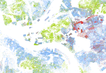
national racial segregation map by Dustin Cable (2013)
Dustin Cable, at the University of Virginia’s Weldon Cooper Center for Public Service, created a remarkably simple and powerful visualization of 2010 census data that shows racial population density and segregation in America. It simply paints one dot per person inside
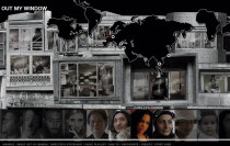
“Highrise” Interactive Documentary by Katerina Cizek (2009-2015)
A multimedia documentary project about life in residential highrises made for the National Film Board of Canada. To be viewed mainly through a web browser. http://highrise.nfb.ca/ Highrise consists of multiple sub-projects such as: The Thousandth Tower: a citizen media project by six residents in

“Bhopal” by Bond Street Theater
bondst.org – via Iframely Bhopal uses theater to talk about a pesticide plant that exploded in Bhopal, India in 1984. The explosion killed over 2,500 people by sunset, making Bhopal “the largest peacetime gas chamber in history.” more…

“Bhopal” by Bond Street Theater
bondst.org – via Iframely Bhopal uses theater to talk about a pesticide plant that exploded in Bhopal, India in 1984. The explosion killed over 2,500 people by sunset, making Bhopal “the largest peacetime gas chamber in history.” more…

“Time Blocks” by Laurie Frick (2014-2015)
Artist Laurie Frick uses the daily time tracking gathered by Ben Lipkowitz, who had been logging his time since 2005. She downloaded all of his data and combed thru it for patterns and uses wood blocks of different thicknesses and sizes

“Time Blocks” by Laurie Frick (2014-2015)
Artist Laurie Frick uses the daily time tracking gathered by Ben Lipkowitz, who had been logging his time since 2005. She downloaded all of his data and combed thru it for patterns and uses wood blocks of different thicknesses and sizes

“On Journalism #2 Typewriter” by Julian Koschwitz
Literally taking on the notion of data being translated into a story, “On Journalism #2 Typewriter” writes the stories of those who died writing stories for us. The piece honors deceased journalists by writing what they never could’ve written for themselves. Using

Engaging the Community and Telling Stories with Ubooly (2014)
Ubooly is a stuffed animal with a smartphone or a tablet for face. The face is animated and tells “stories.” The Ubooly learns the user’s name, favorite color and interests. The Ubooly engages in an active voice conversation with the user, and


