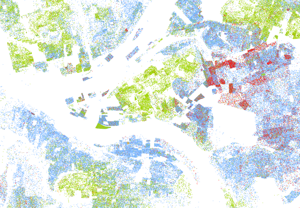
national racial segregation map by Dustin Cable (2013)
|
Dustin Cable, at the University of Virginia’s Weldon Cooper Center for Public Service, created a remarkably simple and powerful visualization of 2010 census data that shows racial population density and segregation in America. It simply paints one dot per person inside of each census tract in the country. If the tract has more densely packed people, the dots are closer together, and vice versa. This is a great way of visualizing the high population density of cities on the eastern seaboard, for instance, and remarkably low density of rural areas covering nearly the whole West. But it goes a step further; dots are colored by race. Questions of racial segregation, nationally and all the way down to block-by-block neighborhood scale, immediately are thrown into relief. Here’s a screengrab I took of Pittsburgh:  Image Copyright, 2013, Weldon Cooper Center for Public Service, Rector and Visitors of the University of Virginia (Dustin A. Cable, creator) The entire zoomable national map is available at http://demographics.coopercenter.org/DotMap/index.html |

