“Accessible Icon Project” by Sara Hendren and Brian Glenny (2010)
|
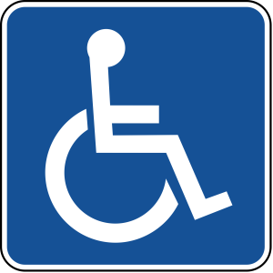
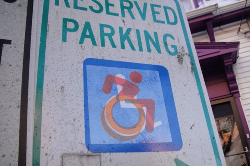
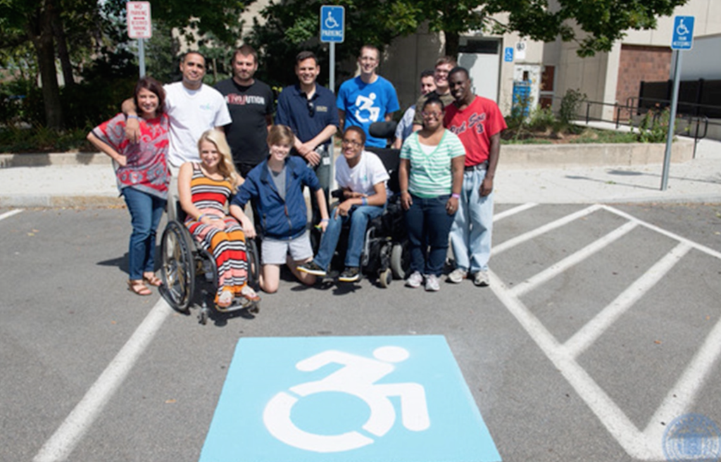
ISO 7001 Dot Pictograms are the stick figure icons that pervade signs of public space. They’re extremely communicative, but one in particular has received a lot of attention recently as being particularly demoting—the universal symbol for accessibility, more commonly known as the handicapped icon. It’s static design communicates a lifestyle far removed from how wheelchairs are actually used—as active, mobile vehicles. In 2010, Sara Hendren, a designer, engineer and educator with a focus on accessibility, and Brian Glenny, a graffiti artist, teamed up to address this issue by creating a sticker depicting a more active wheelchair user that they placed on signs throughout urban areas. Although technically considered graffiti, this small urban intervention attracted large media attention for the clear statement it made—that those with disabilities are not passive targets but active, participatory, mobile members of society. With the help of others, they continued developing the design into a symbol for true accessibility, and it has been widely adopted by similar communities throughout the world since. What speaks to me most about this project is that an incredibly simple provocation can have such dramatic and profound results. The red of the sticker attracts attention to the “graffitied” sign and the clear backing allows for the juxtaposition of existing and possible interpretations of accessibility. Above all, the statement elegantly communicates its intent and message. More Resources: |


